Engineering Analytics
The SPACE analytics dashboard: unlocking Developer Productivity through data-driven, actionable insights


The software development world constantly grapples with the elusive concept of "productivity." Traditional metrics often fall short, failing to capture the intricate web of factors that truly influence how effectively teams build and deliver software. Lines of code are notoriously unreliable, story points can be gamed, and hours logged tell little about value created. This is where the SPACE framework offers a much-needed, holistic perspective.
Developed by researchers at GitHub, Microsoft, and the University of Victoria, SPACE provides a multi-dimensional model for understanding developer productivity, encompassing:
· Satisfaction & Well-being: How happy, healthy, and engaged are developers?
· Performance: How effective is the software and the development process in delivering value and quality?
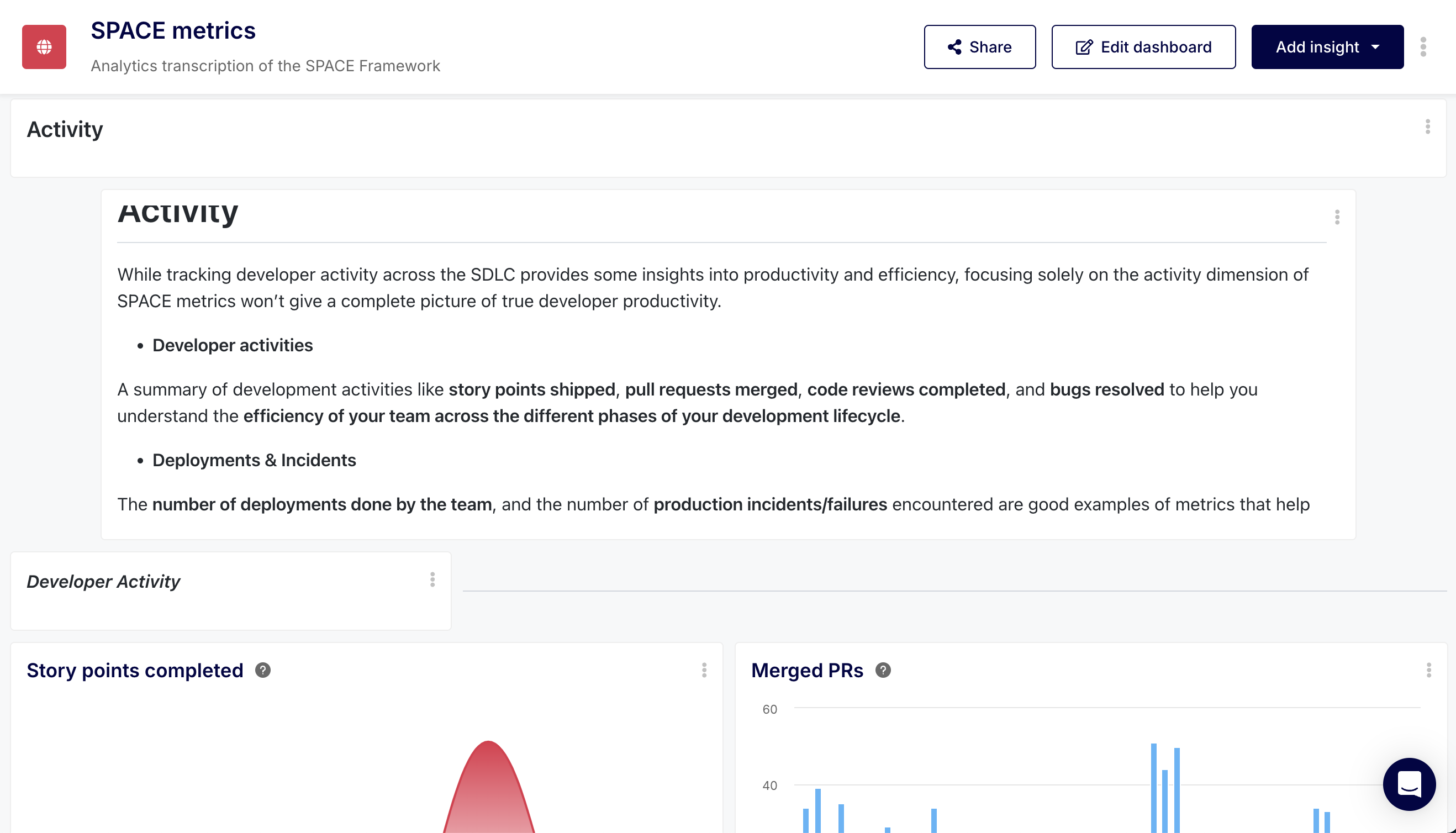
· Activity: What development tasks are being performed? What is the volume of output?
· Communication & Collaboration: How effectively do individuals and teams work together and share information?
· Efficiency & Flow: How smoothly and quickly does work move through the system without interruption or delay?
While the framework provides a robust conceptual model, the challenge lies in translating these dimensions into tangible, measurable insights. This is precisely where a well-configured Software Development Lifecycle (SDLC) analytics dashboard becomes indispensable. It moves beyond subjective assessments and provides factual data to understand, diagnose, and improve the development ecosystem.
This post will dissect the specific insights (widgets) within this Keypup dashboard, explaining how each connects directly to evaluating aspects of the SPACE methodology and what actionable intelligence they provide.
The dashboard is strategically organized into sections reflecting the SPACE dimensions, and in sub-sections to segment areas of interest within each dimension. Let's examine the key data-driven insights within each section.
A thriving team is built on more than just code; it requires a sustainable, engaging, and fulfilling environment. This section of the dashboard provides a pulse check on the health and happiness of your development team, moving beyond superficial perks to understand workload, stress, opportunities for growth, alignment with meaningful work, and the crucial feeling of making progress.


o SPACE Connection: Directly measures potential risks to Satisfaction & Well-being.
o Elaboration: This heatmap visualizes commit activity by user and day of the week. Consistent, heavy commit activity outside of normal working hours (late nights, weekends) for specific individuals is a strong warning sign of potential burnout. It highlights unsustainable work patterns that negatively impact well-being, even if short-term "activity" seems high.
o Actionable Insight: Use this data to initiate conversations about workload balance and identify individuals who might be overextended. It can prompt reviews of project timelines, resource allocation, or unrealistic expectations, helping to foster a healthier work culture and prevent burnout before it significantly impacts morale and retention.

o SPACE Connection: Impacts Satisfaction & Well-being by highlighting potential task monotony or siloing.
o Elaboration: This heatmap shows the types of work (based on PR labels like "Bug", "Feature","Documentation") individual developers are handling. If a developer is perpetually assigned only bug fixes or only documentation, it can lead to boredom, skill stagnation, and reduced job satisfaction. Conversely, a diverse workload can be more engaging.
o Actionable Insight: Identify developers potentially stuck in monotonous roles. Use this insight to consciously distribute different types of tasks across the team, fostering skill growth, preventing boredom, and improving overall well-being. It also helps ensure knowledge isn't siloed with specific "bug heroes" or "feature specialists".

o SPACE Connection: Primarily an Activity metric, but provides crucial context that indirectly relates to Satisfaction & Well-being.
o Elaboration: This heatmap shows commit volume per project over time. While commit volume itself doesn't equate to stress or satisfaction, its distribution provides context. Seeing effort heavily concentrated on a single, perhaps legacy or high-pressure project, especially during identified "rush periods", can signal a potential impact on the well-being of the developers involved. Conversely, seeing effort spread across projects, including those perceived as innovative or strategic, might correlate with higher engagement and satisfaction, assuming workloads are balanced. Identifying long-neglected projects (low commit volume) might also point to developer frustration if they desire to improve those areas but lack the allocated time.
o Actionable Insight: Use this heatmap in conjunction with other metrics (like work patterns and workload distribution) to understand the context of developer effort. Does a high-commit project correlate with long hours? Is all the effort focused on maintenance, potentially leading to monotony? Does low activity on a key project indicate a resource bottleneck or frustrated desire? This insight helps validate if effort allocation aligns with both business priorities and opportunities for engaging, sustainable work, thereby indirectly supporting developer well-being.

o SPACE Connection: While primarily estimating experience/knowledge based on Activity, it directly impacts Satisfaction & Well-being when used strategically for task assignment and growth.
o Elaboration: This heatmap measures commit volume per user per project, serving as a proxy for experience or familiarity within specific codebases. It can be used to identify deep knowledge or areas of limited experience. Thoughtful application of this insight is key for well-being. Assigning developers tasks solely in their comfort zone can lead to stagnation, while constantly throwing them into overly complex, unfamiliar areas without support breeds stress. However, using this map to identify targeted growth opportunities – assigning work in a new project with appropriate support, or leveraging an expert's knowledge for mentoring rather than just execution – boosts engagement and satisfaction. Effective onboarding using this data also reduces new hire stress.
o Actionable Insights: Use this heatmap not just to identify experts, but to strategically plan growth paths. Assign tasks in less familiar projects to broaden developers' skills, paired with mentorship from identified experts. This prevents expert burnout by distributing knowledge and increases overall team satisfaction by providing clear opportunities for learning and development, directly contributing to positive well-being.

o SPACE Connection: While fundamentally an Activity measure (output volume), it strongly correlates with Satisfaction & Well-being.
o Elaboration: The act of closing issues provides developers with a tangible sense of progress and accomplishment, a key driver of job satisfaction. A steady or increasing rate of closure can contribute to positive morale, suggesting the team is effectively tackling its workload. Conversely, a significant drop might indicate struggles with complexity, resource constraints, or scope creep, all factors that can decrease satisfaction and increase frustration. A surge might indicate a satisfying bug-fixing sprint, but needs monitoring to ensure it's not just rushed work.
o Actionable Insights: Monitor the trend of closed issues as an indicator of the team's perceived momentum. Use significant changes as prompts for discussion during retrospectives. Is a drop due to frustrating blockers? Is a surge sustainable? Understanding the context behind the numbers helps gauge whether this activity translates to genuine satisfaction or hides underlying pressures affecting well-being.

o SPACE Connection: Primarily an Activity metric (output volume), but directly impacts Satisfaction & Well-being through the sense of finality and delivery.
o Elaboration: Merging a Pull Request often represents the final step in a developer's direct contribution to a feature or fix before it heads towards deployment. Seeing their code successfully integrated provides a strong sense of completion and contribution, boosting satisfaction. A consistent flow of completed PRs reinforces this feeling. However a drop could signify frustrating review delays or overly complex tasks impacting well-being, while a sudden surge might indicate rushed, potentially low-quality work which doesn't provide true satisfaction.
o Actionable Insights: Track the trend of completed PRs alongside cycle time metrics (like PR Lead Time and Merge Time). Is the completion rate steady and sustainable? If PRs are completed quickly but often fail later (high CFR), the satisfaction is superficial. If completion rate drops due to review bottlenecks (high Idle/Review Time), address those process issues to improve both flow and developer satisfaction by unblocking their completed work.

o SPACE Connection: Primarily an Activity metric, but directly relevant to Satisfaction & Well-being by showing the nature of the team's collective effort over time.
o Elaboration: This chart trends the volume of PRs created across different categories (Bug, Feature, Enhancement, Docs, etc.). While "Engineering Workload Distribution" looks at individuals, this shows the team's overall focus. A sustained period where the vast majority of effort is on "Bugs" or low-impact "Other" tasks, with little time for "Features" or "Enhancements," can severely impact team morale and satisfaction. Developers thrive on building and creating value; constant firefighting or uninspiring tasks lead to disengagement. Furthermore high volumes across all categories simultaneously can indicate team-wide stress periods.
o Actionable Insights: Analyze the trends in work categories. Is there a healthy balance? Is the team consistently bogged down in reactive work (bugs) at the expense of proactive, engaging work (features)? This insight helps validate if the team's actual work aligns with motivating goals and provides data to advocate for addressing technical debt or quality issues that might be consuming bandwidth needed for more satisfying projects. It also helps identify periods of collective high stress.

o SPACE Connection: Relates to Satisfaction & Well-being (workload stress) and Efficiency & Flow (context switching).
o Elaboration: This chartbreaks down the number ofopen, assigned tasks for each user, categorized by their current status (e.g., 'Needs Attention', 'Waiting for Review'). A high number of concurrent open tasks per developer often correlates with excessive context switching, which hinders flow and increases stress, impacting satisfaction.
o Actionable Insight: Helps managers and team leads visualize individual workloads. If someone consistently has a high number of tasks in progress, it might indicate they are overloaded or struggling to focus. This data can support decisions about task reassignment, better work-in-progress (WIP) limits, or identifying blockers hindering task completion.
This section delves into the Performance dimension of SPACE, focusing not just on the speed or volume of development, but critically on the quality, reliability, and overall effectiveness of the software being delivered. It's about understanding whether the team is building the right thing well, ensuring stability, and achieving the desired impact for users and the business through efficient processes.


o SPACE Connection: Directly relates to Performance (quality, effectiveness) and Efficiency & Flow.
o Elaboration: This line chart tracks commits identified as "refactor" or "improve" over time as a ratio of the overall work. While some rework is healthy for maintenance, a consistently high volume of rework can indicate underlying issues: unclear initial requirements leading to changes, poor code quality necessitating frequent fixes, or an unstable codebase. This rework consumes development time that could be spent on new value, impacting performance and slowing down flow.
o Actionable Insight: A sustained high level of rework prompts investigation. Are requirements clear enough? Is technical debt becoming unmanageable? Are initial implementations rushed? This data helps pinpoint systemic issues affecting code quality and development efficiency, leading to improvements in planning, coding standards, or testing.

o SPACE Connection: Impacts Performance (predictability, delivering on commitments) and Satisfaction & Well-being.
o Elaboration: Tracking the trend of overdue items is crucial for performance. Consistently missing deadlines indicates problems with estimation, planning, or execution, impacting the team's ability to deliver value predictably. As mentioned earlier, it also negatively affects developer satisfaction.
o Actionable Insight: This trend analysis helps teams evaluate the realism of their planning and estimation processes. A rising trend necessitates a review of capacity, estimation techniques (like story pointing accuracy), or identification of recurring bottlenecks delaying work. It drives improvements in predictability.

o SPACE Connection: Core DORA metric directly measuring system Performance and stability.
o Elaboration: This area chart shows the percentage of merged pull requests (weighted by commits) labeled as fixing bugs ("bug"). It estimates how often changes introduced into the main branch lead to failures requiring corrective action. A high CFR indicates issues with quality gates, testing, or the deployment process itself, directly impacting the performance and reliability of the software delivered.
o Actionable Insight: Monitor this metric against industry benchmarks (like DORA's <15% for elite performers). A high or increasing CFR should trigger a deep dive into the root causes. Are automated tests insufficient? Is there view process catching critical issues? Are environments inconsistent? This data drives targeted improvements in testing, review, and deployment practices to enhance stability.

o SPACE Connection: Another key DORA metric directly reflecting system Performance and operational excellence.
o Elaboration: This KPI tracks the average time taken to resolve issues labeled as "Incidents." It measures the team's ability to quickly recover from production failures. A low MTTR indicates robust monitoring, effective alerting, well-practiced incident response procedures, and potentially good system design (e.g., easy rollbacks), all contributing to higher performance and user trust.
o Actionable Insight: A high MTTR signals problems in the incident response pipeline. Investigate bottlenecks: Are alerts effective? Is escalation clear and fast? Do teams have the right tools and access? Is run book documentation adequate? This metric drives improvements in operational practices, monitoring, and potentially system architecture to minimize downtime.
While not the sole measure of productivity, understanding what developers are doing and the volume of their output provides crucial context for the other SPACE dimensions. This section quantifies development tasks and their immediate outcomes.

o SPACE Connection: Measures Activity (output volume) and informs Efficiency & Flow planning.
o Elaboration: This KPI and sparkline tracks the volume of estimated work (story points) completed over time. While susceptible to misuse if treated as a direct productivity score, it provides a valuable measure of the team's throughput. Understanding historical completion rates helps in more accurate future planning.
o Actionable Insight: Use this historical data during sprint planning and retrospectives. It allows the team to make more realistic commitments based on demonstrated capacity, rather than guesswork. This improves sprint success rates, predictability (Performance), and reduces the stress of overcommitment (Satisfaction &Well-being).
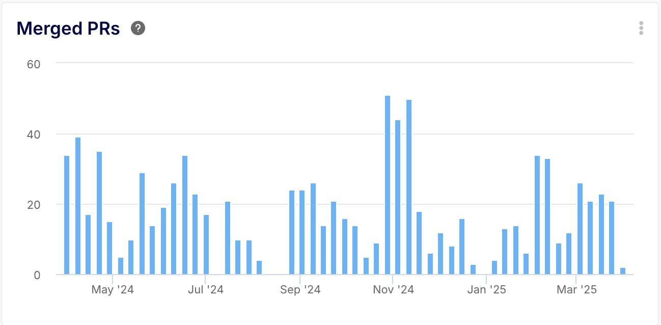
o SPACE Connection: Measures Activity related to code integration.
o Elaboration: Similar to closed issues, these track the volume of pull requests successfully integrated. Changes in these trends can reflect shifts in work patterns (e.g., moving to smaller, more frequent PRs vs.large, infrequent ones) or potential blockages in the review/merge process.
o Actionable Insight: Monitor for significant deviations from established patterns. Combine with cycle time metrics (like PR Lead Time) to understand if changes in volume correspond to changes in speed or process efficiency.

o SPACE Connection: Basic measures of Activity.
o Elaboration: These KPIs provide simple counts of resolved items. While not indicative of complexity or value, significant deviations from the norm (sudden drops or surges) can signal changes in team focus, capacity, or potential process issues that warrant further investigation.
o Actionable Insight: Primarily used for detecting significant shifts. A sudden drop might correlate with holidays, focus on a large complex feature, or a process bottleneck. A surge might indicate a bug-fixing sprint or improved efficiency. Use these as conversation starters, cross-referencing with other metrics for context.

o SPACE Connection: Quantifies the outcome distribution of review Activity, providing context for Communication & Collaboration effectiveness.
o Elaboration: This pie chart breaks down completed reviews by their final state (Approved, Changes Requested, etc.). It measures the typical immediate result of the review activity. A high proportion of "Changes Requested" indicates that the review activity frequently leads to rework, impacting downstream Efficiency & Flow. A high proportion of "Approved" might suggest efficient initial development or potentially less rigorous review activity (requiring correlation with Performance metrics like CFR).
o Actionable Insights: Provides a quick overview of review outcomes. Use the distribution to inform discussions about code quality upon submission and review rigor. If "Changes Requested" is high, investigate if initial PR quality can be improved or if review standards are leading to excessive iteration. If "Approved" is high but CFR is also high, it might suggest reviews need to be more critical.

o SPACE Connection: Measures a critical negative Activity (occurrence of failures) that directly informs system Performance.
o Elaboration: This column chart tracks the raw number of events labeled as "Incidents" over time. While the impact and resolution time of incidents are key Performance indicators (measured by MTTR), the sheer frequency of these events is an important Activity measure. It quantifies how often disruptive failures are occurring as a result of deployment or other system activities. A high volume of this specific activity indicates underlying problems.
o Actionable Insights: Monitor the trend of incident occurrences. A high or increasing count is a strong signal that deployment processes, testing strategies, or code quality require urgent attention (impacting Performance and Efficiency). This activity data quantifies the scale of the stability problem and provides justification for investing in remediation efforts, complementing the MTTR metric which measures response effectiveness.

o SPACE Connection: Measures the Activity of defect identification, influencing Performance.
o Elaboration: Tracks the volume of new items labeled as "bugs" being created over time. Provides insight into the rate at which new defects are being found, potentially indicating issues with recent releases or testing effectiveness.
o Actionable Insight: A surge might indicate quality issues in recent deployments or improved defect detection. A drop could mean higher quality releases or reduced testing focus. Use in conjunction with "Bugs Evolution Breakdown" for severity context.

o SPACE Connection: Provides crucial detail on the nature of open bug Activity, directly informing Performance priorities.
o Elaboration: This chart tracks the count of open bugs over time, crucially broken down by severity (Critical, High, Medium, Low, etc.). While the total number of open bugs is an Activity measure, understanding the severity distribution defines the nature and urgency of that activity. A large volume of low-severity bugs is very different from a small number of critical ones.
o Actionable Insights: Allows teams to prioritize bug-fixing activity based on impact. A rising trend specifically in critical or high severity bugs signals a significant risk to system Performance and user experience, demanding immediate attention. Tracking trends within each severity category helps allocate bug-fixing resources more effectively, ensuring the most impactful activity (fixing critical bugs) is prioritized.

o SPACE Connection: Provides a detailed view of ongoing Activity.
o Elaboration: This large card view moves beyond aggregate counts to list the specific open issues and pull requests currently assigned to team members, often sorted by due date. It consolidates information from potentially multiple sources (like Jira + GitHub) into a single view. This provides a granular understanding of the exact nature and composition of the team's active workload at any given time – what features, bugs, or tasks constitute the current activity.
o Actionable Insight: Offers immediate visibility into what everyone is working on right now. Use it for tactical planning, daily stand-ups, and identifying potential near-term roadblocks or dependencies between tasks. It complements project boards by providing a cross-tool, developer-centric view of assigned activities.
This section evaluates the Communication & Collaboration dimension of SPACE, focusing on how effectively team members interact, share knowledge, and contribute to collective efforts like code reviews. Strong collaboration, as the text notes, is fundamental for efficient development by preventing silos, ensuring shared understanding, and facilitating smoother workflows.


o SPACE Connection: Highlights specific focal points of Communication & Collaboration effort within the review process.
o Elaboration: This list specifically identifies the pull requests that received the highest number of individual review submissions. Unlike the comment count, this focuses on the formal review cycles. Having a few PRs dominate this list suggests those specific items required an unusually high degree of collaborative effort and scrutiny, potentially due to significant functional or technical blockers. An even spread indicates a more typical distribution of collaborative review effort.
o Actionable Insight: Use this list to investigate outliers that consumed disproportionate review collaboration. Drill down into these specific PRs: Was the initial code overly complex? Were requirements unclear leading to multiple review iterations? Did technical disagreements necessitate many rounds of feedback? Understanding these patterns helps improve initial code quality, requirement clarity, or technical alignment to make future review collaboration more efficient.

o SPACE Connection: Reflects Activity within the Communication & Collaboration sphere.
o Elaboration: This tracks the raw number of reviews submitted. A healthy number indicates engagement in the peer review process, a cornerstone of collaboration and quality assurance. Very low numbers might suggest reviews aren't happening consistently.
o Actionable Insight: Monitor for consistent review activity. A drop could indicate reviewer overload or a de-prioritization of reviews. Use it alongside PR Review Ratio and Review Time metrics to get a fuller picture of review health.

o SPACE Connection: Measures the effectiveness of Communication & Collaboration processes and impacts Performance (quality).
o Elaboration: This crucial metric tracks the percentage of merged PRs that met their required approval count. It directly assesses whether the established peer review process (a key collaboration mechanism) is being followed. Low ratios indicate potential bypasses of quality gates, risking performance and undermining collaboration norms.
o Actionable Insight: A ratio below target (ideally near 100%) demands investigation. Why are PRs merged without full review? Is it due to emergencies (which should be documented), process misunderstanding, or deliberate bypassing? This data drives enforcement of review policies and reinforces the importance of collaborative quality control.

o SPACE Connection: Directly measures a key aspect of Communication & Collaboration efficiency by quantifying the time actively spent in the review feedback loop.
o Elaboration: This insight tracks the average time elapsed from the initiation of the first review action (like a comment or formal review submission, depending on platform specifics) to the submission of the last review action on a Pull Request. It represents the active duration of the collaborative review process itself. Longer review times can indicate complex code requiring extensive discussion, unclear initial implementations, reviewer availability constraints, or inefficient communication patterns during the review cycle.
o Actionable Insight: A consistently high PR Review Time signals potential friction in collaboration. To shorten this cycle: encourage smaller, more focused PRs that are quicker to digest and review; foster a culture where dedicated time is allocated for reviews; invest in mentoring to improve the efficiency and quality of reviews provided; and investigate if underlying issues like complex code patterns, knowledge gaps, or process inefficiencies are prolonging discussions.

o SPACE Connection: Directly measures the responsiveness component of Communication & Collaboration, highlighting potential delays in the handoff between development completion and the initiation of the collaborative review process.
o Elaboration: This insight calculates the average time lag between when a review is first requested on a Pull Request and when the first reviewer actively begins the review (indicated by actions like submitting a comment or a formal review, depending on Git platform specifics). Essentially, it quantifies the "waiting time" before collaborative feedback starts. A high idle time suggests PRs are sitting ready for review but aren't being picked up promptly by the team.
o Actionable Insight: Consistently long PR Idle Times often point towards reviewer bottlenecks (overload or poor prioritization), lack of clear review request signals, or hesitation to start reviewing large/complex PRs. To reduce this latency, focus on: promoting smaller, more manageable PR sizes; ensuring reviewers have adequate capacity and visibility into the review queue; optimizing team planning to avoid reviewer overload; and ensuring review requests are made promptly once a PR is ready.

o SPACE Connection: Highlights the final coordination aspect of Communication & Collaboration and Efficiency & Flow, measuring how quickly approved work is integrated into the main codebase.
o Elaboration: This insight calculates the average time taken from the moment a Pull Request receives its final required approval until it is actually merged. It represents the latency in integrating code that has passed review and is deemed ready for production or the next stage. A consistently high merge time can indicate bottlenecks in the final integration steps, ambiguity over who is responsible for merging, delays due to manual post-approval processes (like staging deployments), or complex dependencies blocking the merge.
o Actionable Insight: If merge times are lengthy, investigate the post-approval process. Clarify who is responsible for merging approved PRs (e.g., last reviewer, author, tech lead). Ensure those responsible have the capacity and clear instructions for any pre-merge steps (like deploying to staging). Look for opportunities to automate post-approval tasks. Additionally, reducing inter-PR dependencies by keeping PRs focused can prevent situations where one approved PR has to wait unduly for another to be merged.

o SPACE Connection: Provides a comprehensive view integrating Efficiency & Flow with Communication & Collaboration by breaking down the entire PR journey into distinct phases, highlighting potential delays at each handoff or collaborative step.
o Elaboration: This crucial insight visualizes the average time spent in each distinct stage of a Pull Request's lifecycle, from the initial commit to the final merge. It typically breaks down into: Coding Time (development effort), Idle Time (waiting for review pickup), Review Time (active review and iteration), and Merge Time (post-approval integration). By seeing the relative duration of each stage, teams can understand the complete flow and pinpoint where the most significant time investments or delays occur within their collaborative development process.
o Actionable Insight: Use this overview to identify the primary bottlenecks in your PR workflow. Is Coding Time excessively long, suggesting task complexity or unclear requirements? Is Idle Time high, indicating reviewer capacity issues? Is Review Time drawn out, pointing to inefficient feedback loops or large PRs? Is Merge Time slow, revealing post-approval process friction? Address the specific stage(s) consuming the most time by implementing targeted improvements like reducing PR size, allocating dedicated review time, clarifying merge responsibilities, or improving task scoping, thereby enhancing overall collaborative efficiency and throughput.

o SPACE Connection: Provides visibility into Communication & Collaboration effectiveness between different functional teams (e.g., Product, Dev, QA, Ops) by tracking the time spent in distinct stages of the entire issue lifecycle, highlighting potential friction or delays at handoff points.
o Elaboration: This widget breaks down the average time an issue (from Jira/Trello) spends in key phases like 'Pickup' (waiting to start), 'Implementation' (active development), 'QA' (testing), and 'Release' (deployment/final steps). While primarily an Efficiency & Flow metric, significant time spent in stages like QA or Release often reflects challenges in cross-functional communication, coordination, or clarity of handoffs between Development, Testing, and Operations teams. Similarly, long Pickup times might indicate unclear communication of requirements from Product to Development.
o Actionable Insight: Analyze the duration of each stage to identify collaborative bottlenecks. If QA time is high, investigate if communication between Dev and QA regarding requirements or testing procedures needs improvement. If Release time lags, examine the coordination and communication between Dev/QA and Ops for deployments. If Pickup time is excessive, review the clarity and communication of issue requirements from Product/Planning to the development team. Streamlining these inter-team communications and handoffs is crucial for reducing overall issue cycle time.

o SPACE Connection: Directly reflects the intensity and focal points of Communication & Collaboration by highlighting the issues and pull requests that generated the most discussion.
o Elaboration: This list ranks work items (both issues and pull requests) based on the sheer volume of comments received over the selected period. A high concentration of comments on a few specific items often signals intense back-and-forth discussion, potentially stemming from complex requirements, technical blockers, scope ambiguity, or significant debate needed to reach resolution. An even spread of comments across items might suggest a more consistent level of complexity and stable communication patterns within the team's processes.
o Actionable Insight: Use this list to pinpoint items that required significant collaborative effort or encountered communication hurdles. Investigate the items with the highest comment counts: Were the initial requirements unclear? Did unexpected technical challenges arise? Was there scope creep? Understanding why these items generated so much discussion can lead to improvements in initial scoping, technical planning, or requirement definition, potentially reducing excessive back-and-forth on future items.

o SPACE Connection: Quantifies the average level of peer-to-peer Communication & Collaboration activity occurring within the context of individual Pull Requests.
o Elaboration: This insight calculates the average number of comments made by individuals other than the PR author on pull requests over time. It serves as a proxy for the intensity of peer interaction and discussion surrounding code changes. A high average might indicate strong mutual support and thorough review, but could also signal underlying issues like unclear code, complex tasks requiring significant guidance, or lengthy debates. Conversely, a low average might suggest efficient, clear PRs needing little discussion, or potentially a lack of reviewer engagement or capacity. Trends over time are more informative than absolute numbers.
o Actionable Insight: Monitor the trend of average peer comments. A decreasing trend could positively indicate growing team maturity and clarity, but negatively signal reduced engagement – correlate with performance metrics like bug rates or cycle times to differentiate. An increasing trend could positively reflect improved collaborative support, but negatively suggest team members are struggling with task complexity or require more upfront clarity. Investigate significant trend shifts to understand the root cause and adjust processes, training, or task assignments accordingly.

o SPACE Connection: Measures the intensity of feedback within formal review instances, reflecting the Communication & Collaboration dynamics specifically related to review quality and potential rework signals.
o Elaboration: This metric calculates the average number of distinct comments included within each formal review submitted on pull requests (e.g., comments attached to a "Request Changes" or "Approve" review). A high average indicates that individual reviews frequently contain many specific points requiring clarification, simplification, or correction. This often suggests that the submitted code requires significant refinement, potentially increasing reviewer workload and prolonging the collaborative cycle needed to reach an approved state.
o Actionable Insight: Track this average over time. A consistently high or rising number can signal issues with initial code quality, unclear standards, or overly complex PRs burdening the review process. Use this insight to initiate conversations about improving pre-review quality checks (e.g., self-reviews, automated linting/testing), refining coding standards, breaking down complex features into smaller PRs, or enhancing reviewer feedback skills to make collaborative reviews more focused and efficient.
This section of the SPACE framework assesses how effectively and smoothly work moves through the entire development system, from initial idea to deployment. It focuses on minimizing interruptions, reducing delays, and eliminating friction points to ensure a continuous and efficient delivery pipeline.


o SPACE Connection: Directly measures Efficiency & Flow by quantifying the rate at which completed work (represented by merged PRs) moves through the final stages of the development pipeline and is delivered.
o Elaboration: This insight calculates the average number of Pull Requests merged per day over the selected period. It serves as a key indicator of the team's ability to consistently ship value, whether features, fixes, or enhancements. Higher deployment frequency, a core DORA metric, generally correlates with more efficient processes, reduced batch sizes, and a smoother flow of work through the system, minimizing integration delays and enabling faster feedback loops.
o Actionable Insight: A low deployment frequency suggests bottlenecks hindering the flow of completed work. To improve this, focus on enabling smaller, more frequent merges by: limiting PR size to accelerate review and testing; implementing automated testing (unit, integration, E2E) and code analysis to catch issues earlier and faster; addressing review bottlenecks by ensuring adequate reviewer capacity and seniority; and fostering closer collaboration between development, QA, and operations to streamline the entire release process.

o SPACE Connection: Directly measures Efficiency & Flow by tracking the total time taken for a code change (encapsulated in a PR) to navigate the entire development pipeline from inception to integration.
o Elaboration: This insight calculates the average duration, typically in days, from the moment a Pull Request is created until it is merged. It represents the end-to-end time required for development, review, approval, and merging. A shorter lead time indicates a streamlined, efficient process with minimal bottlenecks, allowing changes to flow quickly through the system. Conversely, a long lead time signals friction points that slow down delivery, potentially causing frustration and delaying value realization.
o Actionable Insight: A high PR lead time warrants investigation into the entire development lifecycle. Key actions include: ensuring clear initial scoping to minimize rework; breaking work into smaller, manageable PRs for faster review and merging; automating testing and code analysis to reduce manual effort and speed up feedback; addressing bottlenecks in review or merge stages by managing capacity and clarifying processes; and fostering collaboration (e.g., involving Product during development) to prevent delays.

o SPACE Connection: Measures Efficiency & Flow across the entire product delivery lifecycle for a unit of work (an issue), encompassing stages beyond just code implementation and review.
o Elaboration: This insight calculates the average time taken from when an issue is assigned (signifying the start of active work) until it is closed (signifying completion and often release). Unlike PR Lead Time which focuses on code changes, this metric provides a broader view of the efficiency of the entire value stream, including potential upstream scoping/design phases and downstream testing/release activities associated with fulfilling the issue's requirements. A low Issue Lead Time indicates an efficient process for delivering features or fixes from conception to completion.
o Actionable Insight: A high Issue Lead Time suggests bottlenecks may exist anywhere from initial requirement refinement to final release. To improve this, consider: breaking down large issues into smaller, manageable units; ensuring issues are clearly defined and scoped before assignment; automating testing (code analysis, E2E) to speed up validation; optimizing review and merge processes (as covered by PR Lead Time); and fostering strong collaboration between product, development, and QA teams throughout the issue's lifecycle to minimize delays and rework.

o SPACE Connection: Relates to Efficiency & Flow and Activity.
o Elaboration: This pie chart distinguishes between PRs linked to planned issues ("Planned") and those created without a corresponding issue ("Orphan" or unplanned). A high percentage of unplanned work often indicates reactive development, frequent context switching due to urgent requests or poor planning discipline, all of which disrupt flow and reduce efficiency.
o Actionable Insight: A high ratio of unplanned work signals a need to improve planning processes, requirement gathering, or enforce the discipline of creating issues before starting development work (even for internal tasks or refactoring). Reducing unplanned work leads to better focus and smoother flow.

o SPACE Connection: This is a core metric for Efficiency & Flow, quantifying the rhythm and throughput of value delivery through the development pipeline.
o Elaboration: Despite the name "Commits frequency," this insight actually measures the average number of Pull Requests merged per day. This serves as a strong proxy for deployment frequency, indicating how often the team successfully integrates and potentially releases code changes (features, fixes, enhancements). A higher frequency generally signifies a healthier, more efficient pipeline with smaller batch sizes, faster feedback loops, and reduced integration risk, aligning with high-performing teams as defined by DORA metrics.
o Actionable Insight: If the frequency of PR merges is low, it indicates blockages in the flow of work to production. Focus on strategies to enable smaller, faster integrations: reduce the scope and size of individual PRs; heavily invest in automated testing (unit, integration, E2E) and automated code analysis/linting to streamline validation; ensure sufficient reviewer capacity and address process bottlenecks; and promote close collaboration across development, QA, and operations to smooth the path to merging and deployment.
.jpg)
o SPACE Connection: Directly impacts Efficiency & Flow by measuring the duration of the primary value-adding phase within the issue lifecycle, highlighting how quickly core work is completed.
o Elaboration: This insight specifically tracks the average time an issue (from Jira/Trello) resides in an "In Progress" or equivalent status, representing the period of active work or development. It isolates the core implementation phase from waiting times (like pickup or QA). A high implementation time often indicates that the assigned issues are large or complex, requiring significant effort, or that the assigned engineer is facing frequent interruptions and context switching due to other demands (e.g., support, reviews, meetings).
o Actionable Insight: If Issue Implementation Time is consistently high, investigate the nature of the work and engineer workload. Consider breaking down larger, complex issues into smaller, more manageable tasks to promote a smoother flow. Analyze engineers' workloads to identify excessive context switching – can parallel tasks like support be better distributed, or can some routine activities be automated to free up focused development time?
The SPACE analytics dashboard by Keypup is far more than a collection of charts; it is a powerful instrument for operationalizing the SPACE framework. By providing factual, quantifiable insights into Satisfaction, Performance, Activity, Collaboration, and Efficiency, it empowers teams to:
1. Identify Bottlenecks: Pinpoint specific areas where processes are slow or inefficient.
2. Diagnose Issues: Understand the root causes behind performance dips or developer dissatisfaction.
3. Make Informed Decisions: Move beyond assumptions and base improvement strategies on real data.
4. Track Progress: Measure the impact of implemented changes and iterate towards continuous improvement.
5. Foster Transparency: Create a shared understanding of team dynamics and performance based on objective data.
By embracing this data-driven approach, development teams can unlock new levels of productivity, improve the quality of their software, and, crucially, cultivate a more sustainable and satisfying environment for the developers who build it. This dashboard provides the map and compass; it's up to the team to navigate towards a more productive and fulfilling future.

.webp)