Understanding and optimizing a development team's performance is a critical concern for engineering leaders. Recently, a customer reached out expressing their pressing need: "We are facing some problems about our dev team performance. Do you have a bunch or metrics that could help us compare and check the people performance?"
This interaction highlighted a common challenge – a lack of clear metrics and tools to assess and improve team effectiveness. This blog post explores our customer's situation and our data-driven approach to helping them gain valuable insights.
The Good practice
The key starting point is to understand what "performance" means in the particular context of a Development Team and a given Company. It is important to recognize that performance is not a one-size-fits-all concept, and that assessing performance is entirely dependent on the context.
Some key questions require answers:
· What are your current pain points? (e.g., Missed deadlines, slow development cycles, bottlenecks)
· What does good performance look like to you? (e.g., Faster delivery, higher quality code, improved team collaboration)
· What are your suspicions about the underperforming areas? (This helps to validate initial assumptions with data later on.)
To do so, there are relevant sets of metrics that can help factually provide answers.
Leveraging Data for Actionable Insights:
You can start with a Pull Request Cycle Time dashboard. This visualization helps pinpoint bottlenecks within the development process by tracking the time spent in each stage of a Pull Request, from creation to merge, using the"Developers" filter to compare different team segments (high-performing vs. those suspected of underperformance). This allows assessing whether feelings and perception align with actual facts and data.
Exploring Deeper Metrics:
If the PR Cycle Time dashboard does not reveal clear answers, additional metrics can be explored, guided by contextual inputs. The following metrics can be considered for instance:
· Lines of Code: While not a perfect metric, it can sometimes indicate if individuals aren't contributing enough code. (This should be used with extreme caution and alongside other metrics).
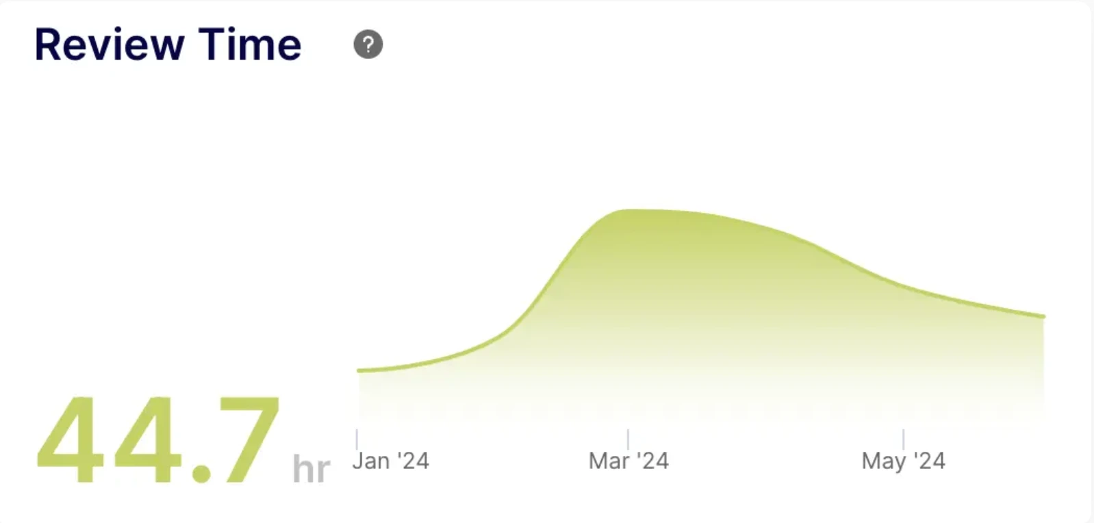
· Review Time: Long review times could signal issues with code complexity or inefficient review processes.
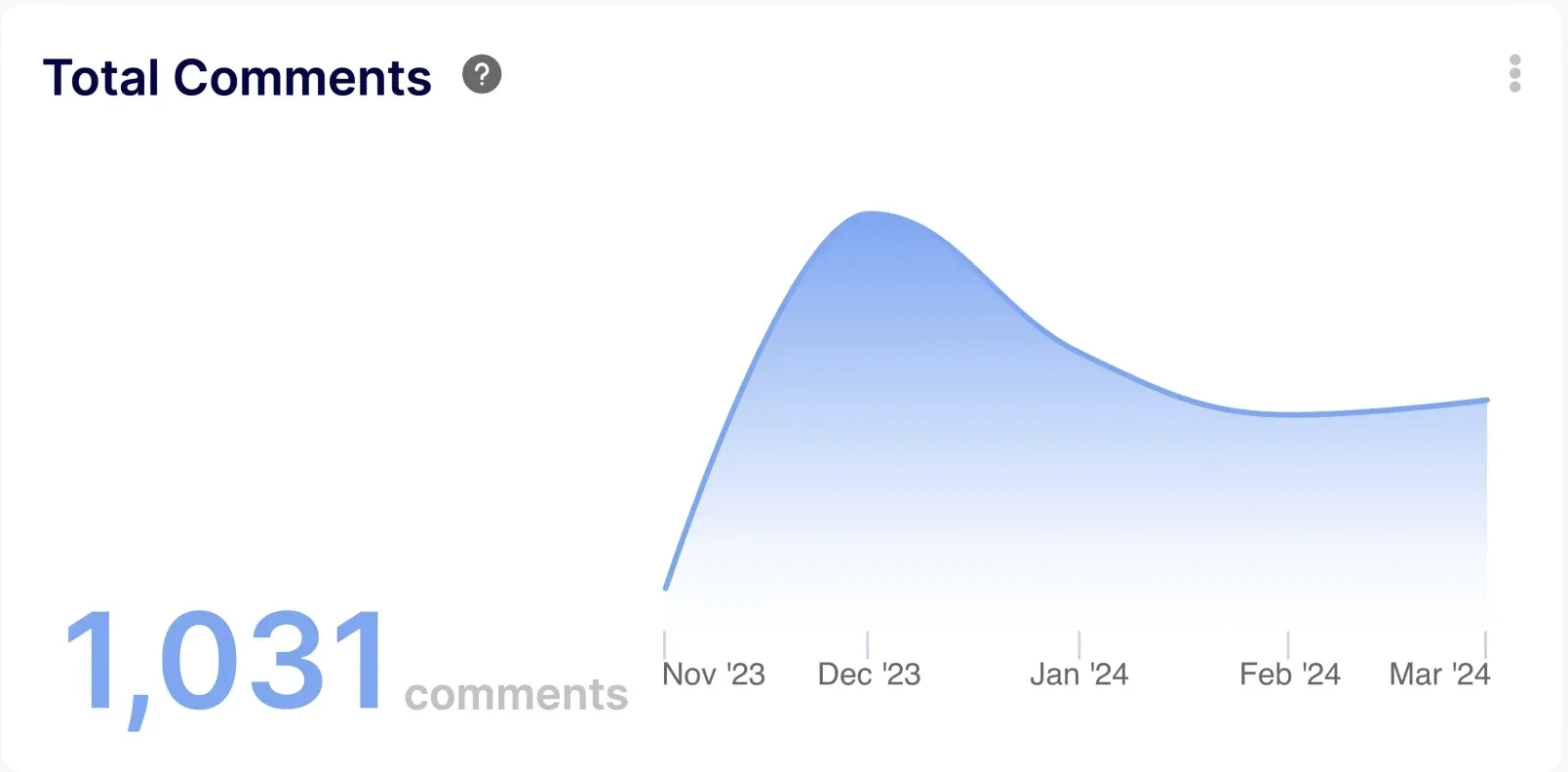
· Number of Comments per Pull Request: Excessive back-and-forth discussions on PRs could highlight communication bottlenecks or unclear requirements.
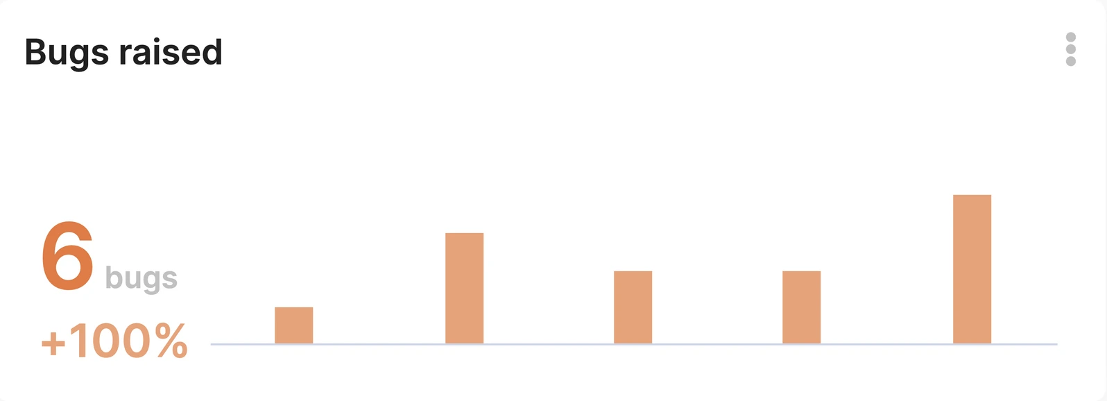
· Bug Introduction Rate: Tracing bugs back to their source can identify developers who might need additional support or training.
The Importance of Context:
Throughout the process, it is essential to consider the context surrounding the metrics. For example, a developer with a high bug introduction rate might also be the one fixing the most complex issues, indicating a different kind of contribution. Therefore, open communication and qualitative feedback are essential alongside the quantitative data.
The Use Case implementation
The key starting point was understanding what"performance" meant to this customer. We initiated a discussion to identify step by step what performance was in this particular case.
The first thing to do was to create a PR Cycle Time dashboard to check where the bottlenecks were.
Using the "Developers" dashboard-wide filter at the top helped gather actual data, to confirm or disprove the“feeling” the customer had. Two strategies were implemented: 1- Enter the usernames of some well performing teams and then some underperforming teams. 2 - Enter the usernames of "suspects" (people they thought were not performing). There we ran a first check. Did the metrics of the PR Cycle Time dashboard confirm the customer gut feel about the performance of their teams and/or the underperforming suspects?
If yes (e.g. they could see high cycle times when filtering on suspects and normal cycles times when filtering on developers that they thought were performing), then it meant that the metrics were aligned with their definition of "performance". From there we could create a dashboard that compared developers with each other based on these metrics.
If no, then we would have needed other metrics. The set of following questions was presented to the customer to help set the correct metrics:
- Did they think the under performing people were not working enough? We could have used lines of code to compare them.

2. Did they think the under performing people made Pull Requests that were difficult to review, therefore consuming the time of well performing engineers? We could use the review time to identify people that were consistently "difficult to review"

3. Were under performing people generating a lot of back & forth discussions? We could have used the number of comments per PR to identify PR authors that generated a lot of back & forth discussions(therefore consuming the time of other engineers).

4. Were under performing people generating a lot of bugs? Was there away to trace those bugs back to them? (e.g. a developer introducing a bug was always the one fixing it, in this case we could have used the author to detect who generated the most bugs).

Building a Customized Team Benchmark Dashboard
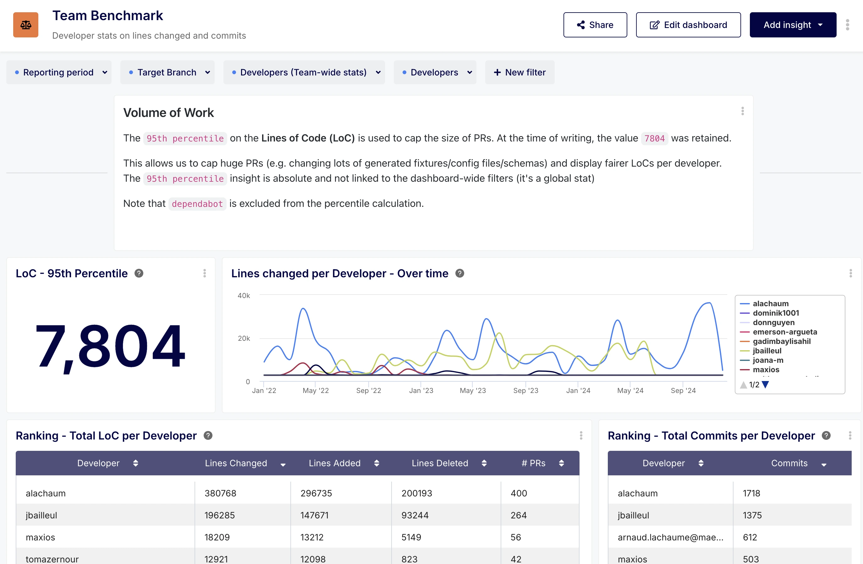
Based on the customer's feedback and insights from the initial analysis, we built a customized performance dashboard tailored to their specific needs. This dashboard aggregated the most relevant metrics, providing a clear overview of team performance and individual contributions.
We recommended using the Developers dashboard-wide filter at the top to progressively exclude top-performing developers (and potential bots if the customer had more than dependabot) from the reports on the dashboard.

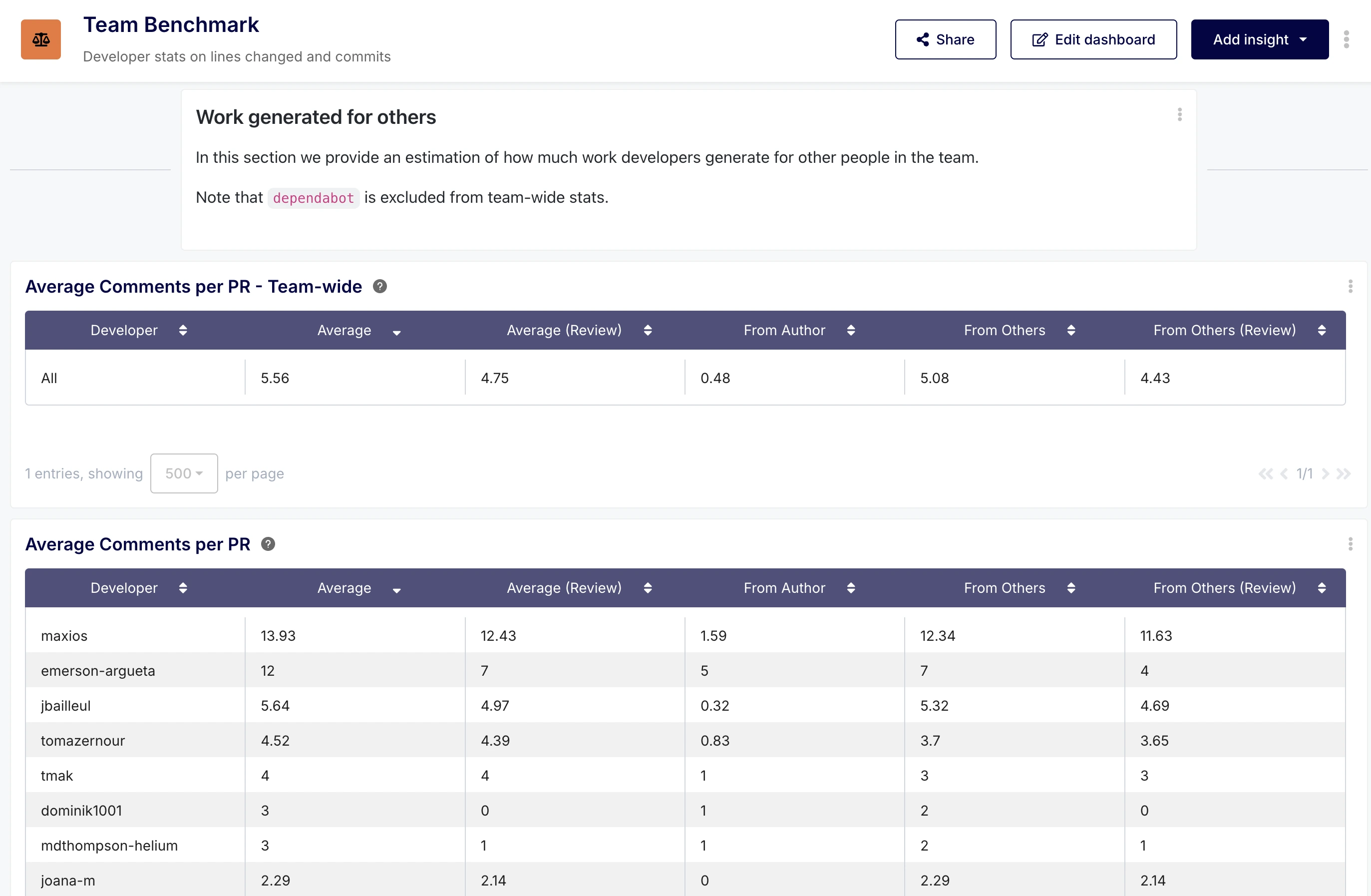
The customer could also control how the team-wide statistics were generated thanks to the dashboard-wide filter Developers (Team-wide stats). The team-wide statistics in the dashboard were useful to compare developers to the "average" of the team. Here again bots such as dependabot were excluded.

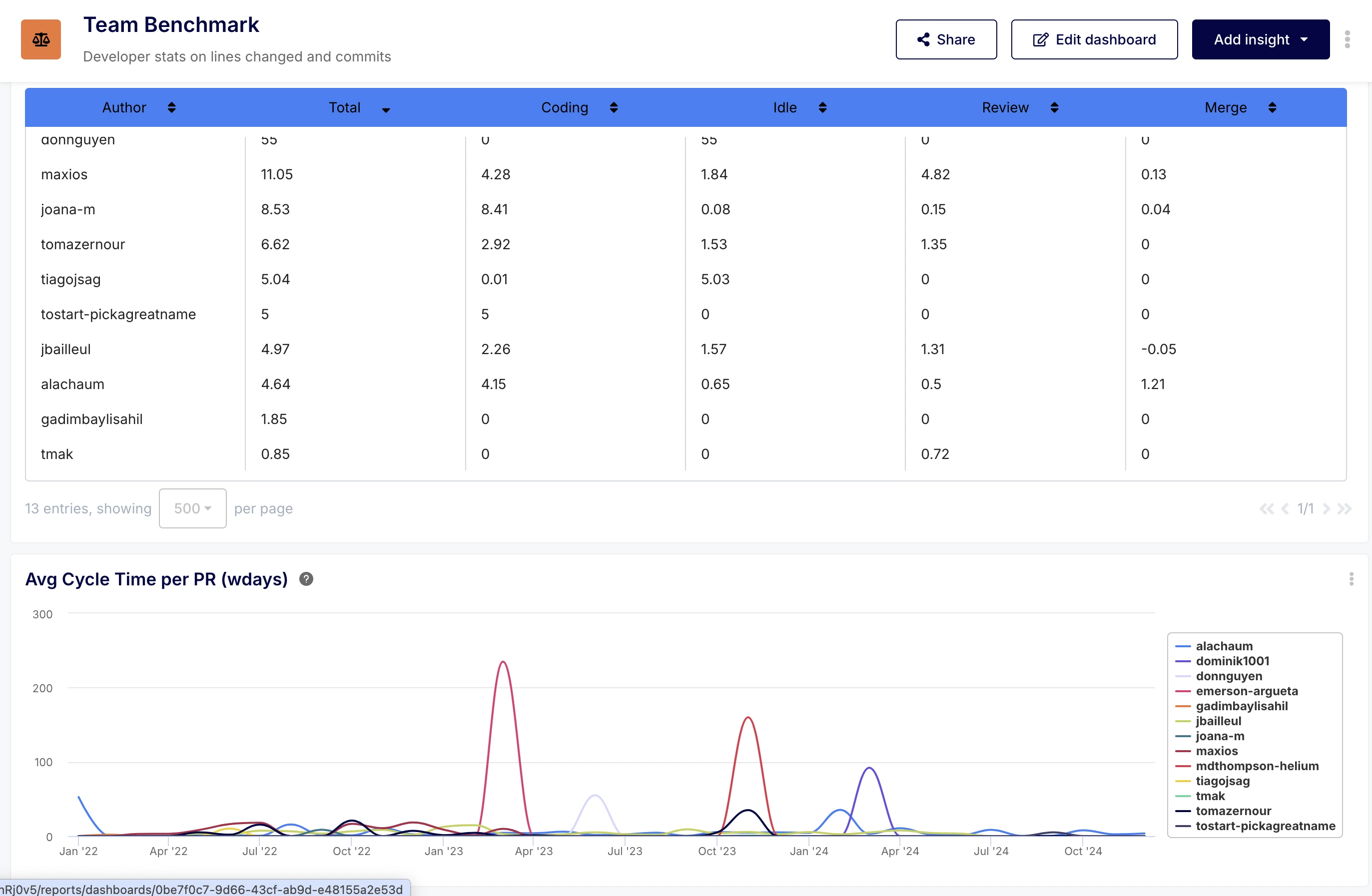
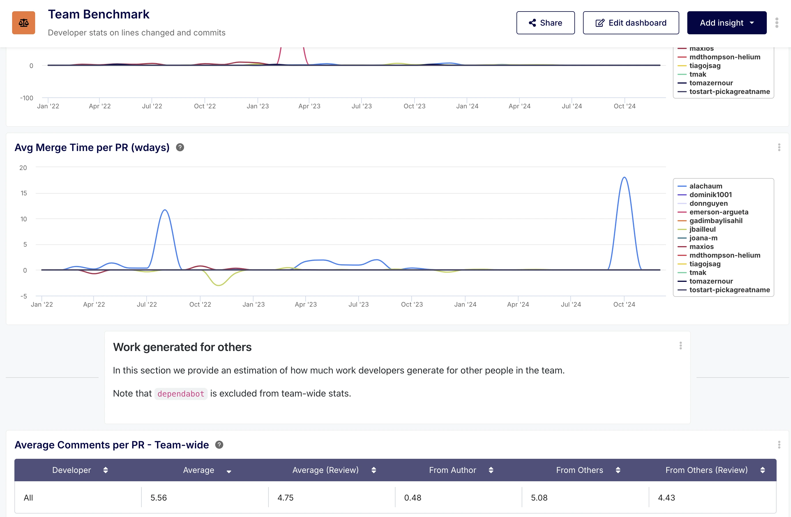
The dashboard was quite comprehensive and looked like this:


Interestingly enough, it showed negative idle times. The idle time being the difference between the first review and the last commit, it seemed odd to see negative values show up.
However, a negative idle time can happen if a review was provided before it was requested (spontaneous review). Surfacing negative values can be meaningful, to identify situations where:
- Spontaneous reviews are left by others because the PR author seeks informal feedback early (via Slack, orally etc.), which is positive
- Spontaneous reviews are left because the PR author always forgets to formally request a review, which is negative.
Every insight on the dashboard was contextualized and had specific documentation, thanks to Keypup’s completely configurable and editable metrics documentation.
Outcome
The customer responded enthusiastically to this approach and results, stating, "That’s exactly what I need! Amazing." By focusing on a data-driven, collaborative approach and tailoring the metrics to their specific context, we were able to provide them with the tools and insights they needed to effectively measure and improve their development team's performance.
This use case highlights the importance of taking into account a Development Organization’s unique context, challenges and objectives in order to deliver pragmatic, actionable, useful metrics. It'sthe metrics that need to adapt to the team, not the reverse.


