Changelog
Find out about Keypup's latest product changes.
Beta release of the Activity Events dataset and streamlined edition of report columns
This release brings a new dataset to the Keypup family! The Activity Events dataset allows engineering managers to create activity feeds as well as historical "open at date" insights 📈 As part of this update we also improved the UX around column handling in our insight editor.
New Activity Events dataset in beta
The Activity Events dataset tracks historical events occurring on Issue and Pull requests. This dataset is currently available in beta and we are collecting feedback to further improve the data model.
The following events are currently captured:
CREATED:
the issue/PR was createdCLOSED:
the issue/PR was closedREOPENED:
the issue/PR was opened was being closedMERGED:
the PR was mergedREVIEWER_ASSIGNED:
a reviewer was assigned (requested reviewers) to the PR. Keypup generates one event per assigned reviewer in case of bulk assignments.REVIEWER_UNASSIGNED:
a reviewer was unassigned (requested reviewers) from the PR. Keypup generates one event per unassigned reviewer in case of bulk unassignments.USER_ASSIGNED:
a user was assigned (assignees) to the issue/PR. Keypup generates one event per assigned user in case of bulk assignments.USER_UNASSIGNED:
a user was unassigned (assignees) from the issue/PR. Keypup generates one event per unassigned user in case of bulk unassignments.WORK_LOGGED:
a user logged some time on the issue/PR.WORKFLOW_STATUS_UPDATED:
the issue transitioned to a new workflow status.
For each event, we also capture useful content fields:
- Parent: The parent issue or pull request is captured through the "Parent > *" fields. This allows you to filter events based on parent attributes such as the issue type, state, or labels.
- Duration: This field is populated on
WORK_LOGGED
events. It allows users to create time spent reports per week and/or per assignee. - Target User: This field is populated on assigned/unassigned events and captures who was the person being assigned or unassigned.
- Workflow Status: This field is populated on WORKFLOW_STATUS_ UPDATED events and captures the destination status
The types of Activity Events will vary slightly based on the apps you connect to Keypup. Here is the list of supported events for each application:
- Github:
CREATED
,CLOSED
,REOPENED
,MERGED
,REVIEWER_ASSIGNED
,REVIEWER_UNASSIGNED
,USER_ASSIGNED
,USER_UNASSIGNED
- GitLab:
CREATED
,CLOSED
,REOPENED
,MERGED
,REVIEWER_ASSIGNED
,REVIEWER_UNASSIGNED
,USER_ASSIGNED
,USER_UNASSIGNED
,WORK_LOGGED
- Bitbucket:
CREATED
,CLOSED
,MERGED
,REVIEWER_ASSIGNED
,REVIEWER_UNASSIGNED
- Jira:
CREATED
,CLOSED
,REOPENED
,USER_ASSIGNED
,USER_UNASSIGNED
,WORK_LOGGED
,WORKFLOW_STATUS_UPDATED
- ClickUp:
CREATED
,CLOSED
. ClickUp does not expose an events API. Keypup generates these two events based on the issue timestamps (date_created
&date_closed
) - Trello:
CREATED
,CLOSED
,REOPENED
,USER_ASSIGNED
,USER_UNASSIGNED
,WORKFLOW_STATUS_UPDATED
All the documentation for the Activity Events dataset can be found here.
So what can you do with Activity Events? Here is a list of insights and reports you can build on Keypup:
- An activity feed showing the most recent actions that were taken for all issues and pull requests, or a subset of them
- An open-at-date report, showing the historical running count of open issues, by summing (cumulative sum) the number of open/reopened events minus closed/merged events
- An "in status" at-date report for Jira/Trello, showing the historical running count of issues that were in a specific status (e.g. In Progress) by summing (cumulative sum) the number of transitions minus the number of transitions to the next status.
- A consolidated report of how much time has been spent on issues, per issue type or label
- An assignment report showing how often engineers get assigned to PRs for review
Have other use cases in mind? Need a hand setting up insights using the new Activity Events dataset? Just ping our team on the chat! 🤓
Easier handling of columns in the insight editor
Many of you were frustrated that columns could not be inserted in the middle of a report 🤯 This forced people to add a column at the end and then move it all the way up.
Well, the pain is over! This release includes two UX improvements related to column handling:
- The table columns in the "Configure table" section now properly use the label defined on the column, instead of using the column number. This makes the overall navigation easier, especially on large reports.
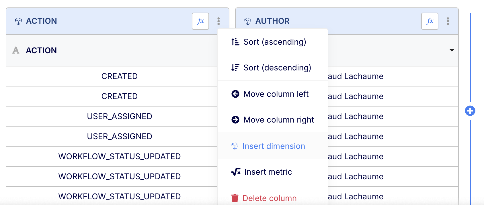
- The column menu now allows you to right-insert a dimension or a metric (depending on the type of insight).
It's a small change but it helps considerably when editing reports 😇
Other improvements and bug fixes
A few additional items worth mentioning 🥰
- Improvement: The state (OPEN/CLOSE) of Jira issues is now purely based on the status category of their workflow status ("done" status category or not). We no longer rely on the resolution field since this field is not longer standard in Jira flows (e.g. Jira Product Discovery does not support this field) and its use has become unreliable (e.g. some issues may have a resolution status without being closed status-wise).
- Improvement: Support
IS_NULL
andIS_NOT_NULL
filtering on number fields. - Bugfix: The edition modal of dashboard-wide filters now displays insights in alphabetical order instead of using the "add date" of each insight.
- Bugfix: Fixed the alphabetical listing of some fields in the datasets
- Bugfix: The search bar in the dashboard share modal now uses case-insensitive search for users
- Bugfix: Gracefully handle the login flow when an old session token is present in the URL (e.g. when bookmarked)
New stacked chart variations, better detection of Jira closure dates and improved auto-filling support on date operators
Our latest release brings new functionalities to some of our existing features, allowing users to unlock even more reporting use cases 🚀 Most of these features were requested by Keypup users, we thank you all for helping us build the best engineering analytics tool 🙏💙
Added multi-metric variants for stacked charts
Our 2-dimensions stacked charts already allow users to create reports using two dimensions (e.g. creation date and author) and one metric (e.g. lines changed, count of PRs), where the second dimension is used to generate the stacked slices.
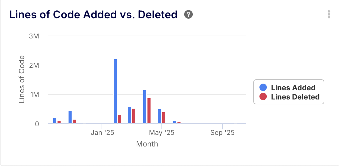
But what if you want to create a chart with one dimension (e.g. creation date) and multiple custom metrics (e.g. sum of lines added and sum of lines deleted)? Well this is now possible thanks to the multi-metric variants! Our standard stacked charts now allow you to specify multiple metrics, which will stack with each other.
Here is the complete list of stacked charts available on Keypup. The multi-metric ones are standard and the (existing) 2-dimensions version have been renamed to be more explicit:
- Stacked Area Charts
- Stacked Area Charts (2-dimensions)
- Stacked Bar Charts
- Stacked Bars Charts (2-dimensions)
- Stacked Column Charts
- Stacked Column Charts (2-dimensions)
Have more use cases for stacked charts? Don't hesitate to contact us via chat!
Improved auto-filling support on date operators
Our auto-filling feature fills the blanks between data points on time series. This is useful to highlight zero-areas or plateaus (cumulative reporting) when data are missing for a given day, week, or month, instead of connecting the dots and giving a false impression of continuity between existing data points. Our auto-filling feature automatically activates when you select a date dimension with a standard formatter such as "Year > Month", "Year > Week" etc.
This week's release extends the auto-filling logic to also apply to custom formulas when using the following operators:
DAY
(1..31)DAY_OF_WEEK
(1..7)DAY_OF_YEAR
(1..365)HOUR
(1..24)MONTH
(1..12)QUARTER
(1..4)WEEK
(1..52)
Note that the auto-filling logic will only activate if the date operator is used as a top-level operator (e.g. MONTH(...)
) and not as a calculation element (e.g. CONCAT("Foo", MONTH(...))
).
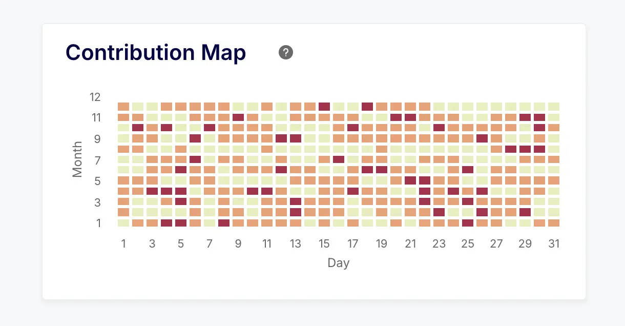
On top of this, we also enabled the auto-filling behavior on heatmaps. This allows you to create visual maps to help understand cyclic patterns, such as a contribution map:
Better detection of Jira closure dates
Our integration was previously solely relying on the use of the Resolution field in Jira to detect the closure state and date of issues. This field is usually populated as part of Jira Workflows when issues reach a "Done" status (this is the default in standard Jira Workflows).
Over the last two years we've observed that the usage of the Resolution field has been declining, becoming less and less standard in Jira projects. Jira Product Discovery, the newest product of the Jira family, even dropped support for the Resolution field.
In order to keep delivering consistent reporting on closed Jira issues, we have updated our Jira integration to detect issue closure if any of the following conditions match:
- A Resolution is set on the issue, in which case the resolution date will be used as the closure date
- The issue is in a Status that has a Status Category set to Done, in which case the closure date will be set to the last Status Category Changed Date. This means that if you post-mortem transition an issue from a done status (e.g. Won't do) to another done status (e.g. Released), the closure date will be set to the first closure event (e.g. Won't do).
Other improvements and bug fixes
A few additional items worth mentioning 🥰
- Improvement: Two new custom formula operators, SHA1 and SHA256, were added. These operators can be used to anonymize reports.
- Improvement: Stop retrieving ecosystem.atlassian.net projects when connecting Jira. These projects start appearing after liaising with Atlassian's support. They do not relate to any business-related project.
- Improvement: Jira project-specific custom fields will not be grouped under their respective project ID. The field name used by these fields in custom formulas will also include the Jira project ID. This is done to help differentiate custom fields with identical names from different projects.
- Improvement: Add negative variants for user filters, allowing you to exclude specific users based on their connected identities. The list is: Is not me, Is not user, does not include me, does not include user.
- Improvement: The maximum number of allowed dimensions and metrics on insights has been increased, from 20 to 30 and 10 to 20 respectively. Many insights will restrict this hard limit further based on type (e.g. a heatmap has two dimensions and one metric, no more no less).
- Improvement: Wait for custom formulas to be valid before triggering a reload of the insight. This improves the custom formula editing experience and avoids many unnecessary reloads.
- Bugfix: Fix the sorting of the axis values (or slice names) for the secondary dimension when using charts with two dimensions. The sorting of the could previously appear out of order.
- Bugfix: The array element accessor (e.g.
assignees[1]
) was not returning the correct type with date or boolean arrays. This could prevent users from applying type-specific operators on some array elements (e.g. Jira custom field sprint date array). - Bugfix: The CSV export functionality of insights was not taking into account the auto-filling behavior of insights.
New Issue Cycle Time Dashboard, Quarterly Grouping, and Value Picker in Configuration Assistant
This week's release delivers a new dashboard that leverages the Time in Column feature released some time ago. It also includes a couple of improvements related to time series and our beloved configuration assistant 💪
New dashboard: Issue Cycle Time for Jira & Trello
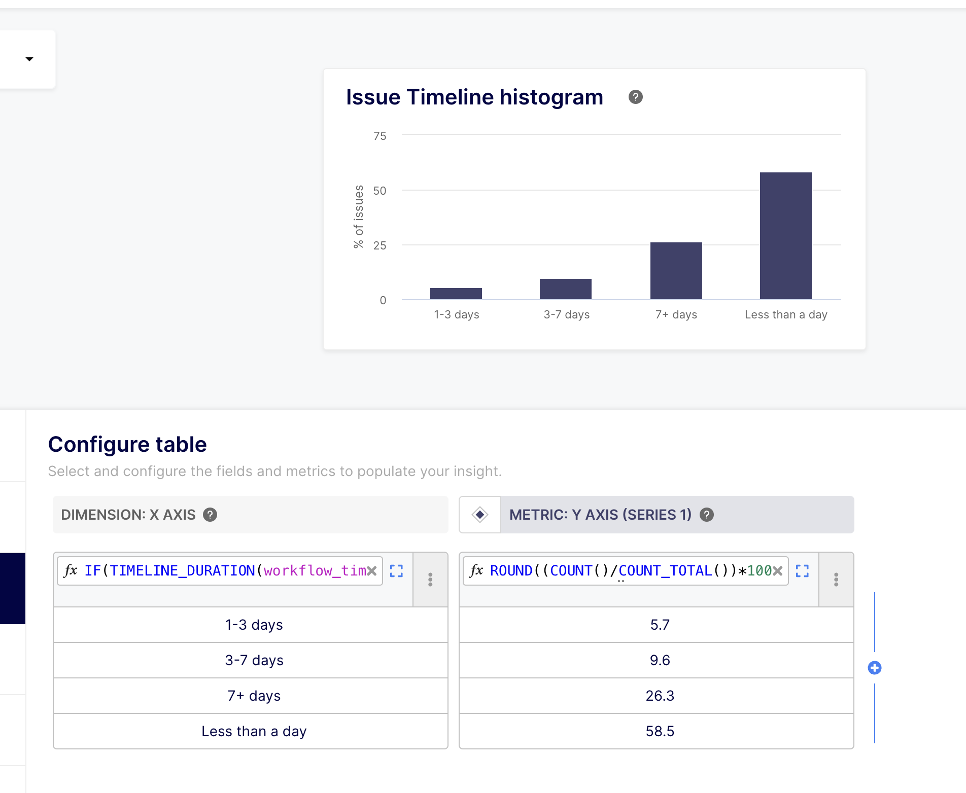
A few months ago we released a series of fields and operators allowing people to report the time spent by Jira & Trello issues into a given status ("Time in Column" feature). These features unlocked very advanced reporting capabilities via custom formulas. However, we were still missing a fully-featured and preconfigured dashboard using the Time in Column field and operators.
The wait is over! To complete our existing Pull Request Cycle Time dashboard, which focuses on core development, we just released an Issue Cycle Time dashboard that analyzes the time spent by issues in their various delivery stages.
The dashboard groups your Jira statuses into four key phases, to facilitate reporting:
- Pickup Time is the total duration spent in the initial status before the development starts (e.g. “To Do”)
- Implementation Time is the total duration spent in the development status (e.g. “In Progress”)
- Quality Assurance (QA) Time is the time it takes to verify that the implementation matches the business objectives (e.g. "In Testing", "In QA")
- Release Time is the time it takes to move the issue to production (E.g. "Ready to Release", "Pending Release Approval").
Our Configuration Assistant allows you to specify the list of Jira/Trello statuses to include in each phase:
Easy enough! Now you can get a detailed view of how long issues spend in each column of your Scrum or Kanban board 😎
Time series: Quarterly grouping in charts
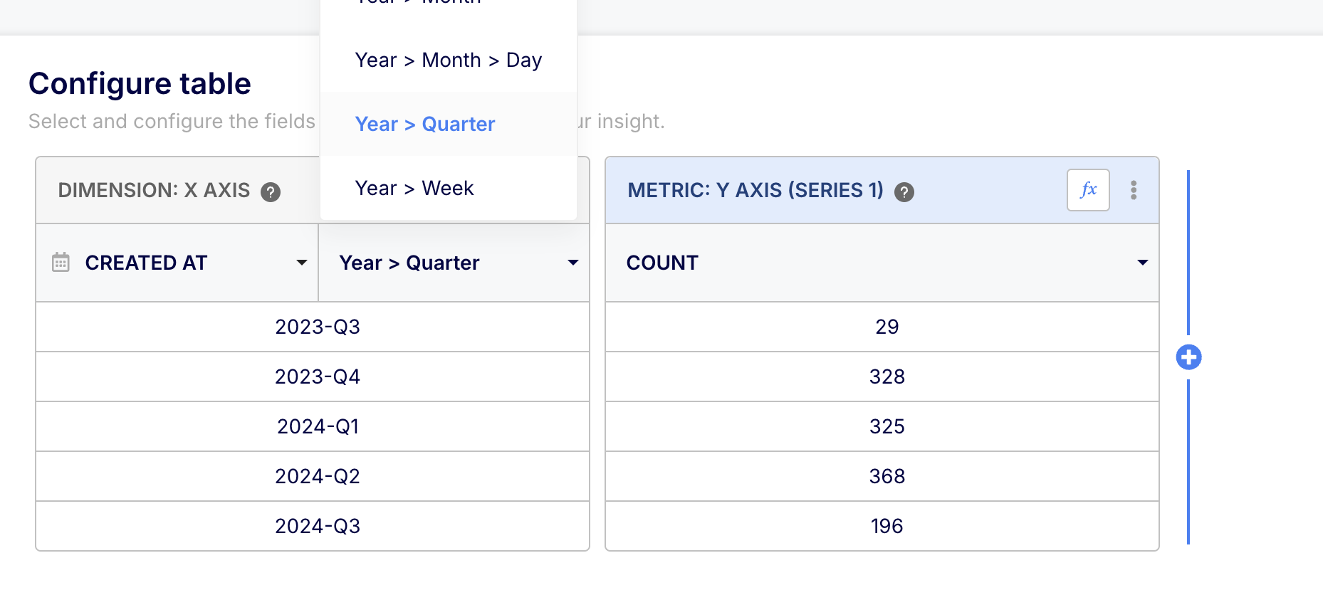
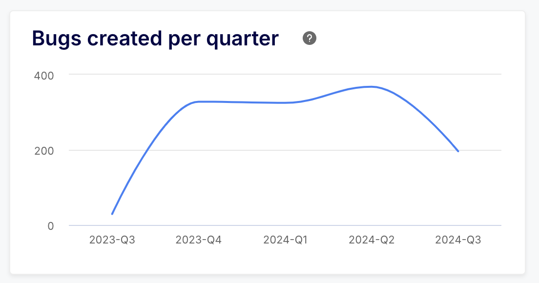
On top of the yearly, monthly, weekly, and daily groupings, we have added the ability to group time series per quarter.
Need to check how you performed this quarter compared to the previous quarter? Now you can 😁
As part of this new feature, we also added two operators to the library of custom formula functions:
- YEAR_QUARTER(datetime), which formats a timestamp field in YYYY-Qx format (e.g. “2023-Q2”)
- QUARTER(datetime), which returns the quarter number for a given date (or the duration of a quarter in seconds when no arguments are provided)
Configuration Assistant simplified thanks to value pickers
Value pickers were already available for insight filters and dashboard-wide filters. But they were still missing in our Configuration Assistant.
Well, good news everyone, they're now available there as well! Picking statuses, labels, and commit keywords while configuring a dashboard or an insight is now dead easy! Just pick the value that is the most relevant to the question.
Check out the gif above to see an example of a value picker in action ⛏️
New presets available for dashboard-wide filters
On top of the existing Reporting Period and Projects presets, you can now quickly create dashboard-wide filters using the App and the Owners fields.
The Owners field was introduced as part of the previous release. Its objective is to facilitate filtering across issues and pull requests, and help identify who is responsible for a given item:
- For issues: the Owners field is equal to the assignees field
- For pull requests: the Owners field is equal to the author field (list with a single element)
Some improvements and bug fixes
A few additional items worth mentioning 😉
- Improvement: Associations between PRs and Jira issues now support using the issue key in branch names (case insensitive) and commit messages (without an auto-closing keyword)
- Improvement: Expand the catalog of errors supported in a human-friendly way when connecting GitLab/Jira hosted instance
- Improvement: The search bar in the insight library now only filters insights based on their title and tags, and no longer uses their description. The use of the description for filtering was returning too many results due to the popularity of certain keywords.
- Bugfix: The due date for issues attached to sprints now uses the last sprint due date instead of the last active sprint due date. The latter was leading to due dates disappearing once a sprint was completed.
- Bugfix: The
CONCAT
operator now supports decimal arguments (was returning an error before) - Bugfix: the unit helpers such as
YEAR
,MONTH
,WEEK,
etc. now return a proper integer instead of a stringified integer. This could cause issues when trying to apply a math operation on the return value of these operators. - Bugfix: Fixed an issue where a Jira user changing name then being rolled back would not be reflected on the Keypup side
Blanks Auto-filling on Time Series, New Dataset Fields, and Email Matching on Login
This week's release highlight is a long-awaited feature: the ability to automatically fill missing data points as zeros on time series. This round of updates also brings some new fields to help filter on resolving PRs and resolved issues and some quality-of-life improvements on our login system.
Auto-filling on Time Series
Your time series charts may look slightly different since you last viewed them. That's because we now fill the blanks with zeros on time series, instead of "just" connecting the dots between values with underlying data. This produces sharper charts and better highlights periods of inactivity.
Let's take the example of a count of pull requests per month and assume the following data:
- July: 17 PRs
- August: 0 PRs
- September: 12 PRs
Previously, our time series would have connected July to September (2 existing data points), leaving an impression that there was some in-between count for August.
With the auto-filling feature, this time series will now display three data points, with the middle one being set to zero, therefore highlighting the lack of activity for August.
The auto-filling feature only fills the blanks between existing data points, not around them. So if you set your insight filters to retrieve data from the last 6 months but only have actual data for the last 4 months, the auto-filling feature will only fill in the blanks within those last 4 months.
If you still want to connect the dots between existing data points only, you can disable this auto-filling feature by editing your insights and going to the Customize Style tab:
New Fields on Datasets
The following new fields have been released to help you make your filtering even more powerful (click the fields to access their documentation).
Comments
Commits
Issues & Pull Requests
Reviews
Email Matching when Logging In with New Identities
When logging in to Keypup with a new identity (e.g. Google), we will now attempt to match this identity with an existing user by looking up identities with verified emails (e.g. GitHub) instead of creating a new Keypup account.
We were previously only matching identities that had been explicitly linked to your account upon logging. This new approach is a bit more flexible, especially when you do not remember which service you used to log in to Keypup.
Improved Insight Builder UI & New Dashboard-wide Filters Presets
This week we are bringing you some quality-of-life improvements, specifically focusing on insight building and dashboard-wide filtering.
Improved Insight Builder UI
You will notice that the UI received some tweaks here and there:
- The Select Visualization section on the sidebar has been removed to streamline the edit flow. Switching visualization is now done via the top left dropdown.
- This Switch Visualization Dropdown has received a lifting and now allows you to switch between regular charts and KPIs. This last one was long overdue but were busy on big bang features (see our previous announcement on Historical Events and Time in Column)
- In the Select Dataset section, fields are now grouped by topic and can be clicked to access their respective documentation (this will open the doc in-app, you can open it in a new tab via ctrl/cmd + click). Many of you have requested more direct access to field documentation to easily explore our extensive dataset, so here it is! Enjoy 🤗
- On the Configure Table section, we have reworked the headers to be more streamlined and provide easier access to custom formulas, which is one of the most powerful features of Keypup, allowing you to build fit-for-purpose metrics via custom calculations.
- Still on the Configure Table section, we've made the size of the Add Dimension/Metric button (+) more visible. Also, adding a dimension/metric now highlights it. This is particularly useful when handling reports with lots of columns. Enjoy adding more dimensions and metrics to insights!
Dashboard-wide Filter Presets
A couple of weeks ago we released Quick Presets for insight filters. Such a great idea that many of you asked us why it was not available for the dashboard-wide filters. Simply because we were cooking it! 🍳
We've added two presets to the dashboard-wide filters:
- Reporting Period: This preset allows you to quickly filter your entire dashboard on a given period. The preset selects the most relevant time field for each insight, based on their filter configuration. Yes, it's magical 🪄
- Projects: This preset allows you to refine your dashboard based on a list of projects or repositories. Not rocket science but very useful.
This is only the beginning! More presets will be added over time. One preset will come to light soon (next few weeks) allowing you to quickly filter an entire dashboard on item ownership (author for PRs and assignees for issues). This is a standard dashboard-wide filter for some of our dashboard templates and we're making it standard.
New Cycle Time Dashboard & Historical Events for GitLab and Trello
This week we are giving you the tools to better Cycle Time on your development flow. Not only are we releasing a new version of the Cycle Time dashboard but we also greatly improved the way we track events on issues and pull requests. The result is more accurate ways to measure the time spent in each stage of development to detect bottlenecks early or simply to measure yourself against elite performers such as Netflix or Amazon.
New Cycle Time Dashboard
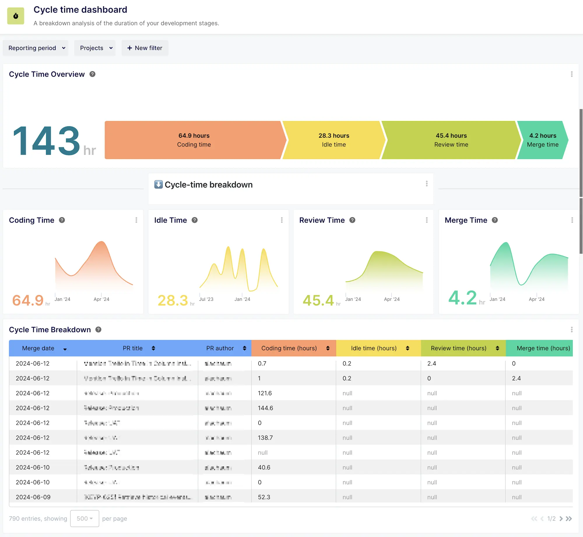
We are delighted to unveil our reworked Cycle Time Dashboard! It is packed with new and enhanced insights to provide teams with the best calculation for each stage of your development process.
Discover the 4 stages of your development process (with the new Idle Time insight) to locate and resolve your bottlenecks and improve delivery.
Historical Events support for GitLab and Trello
The assigned_at, last_assigned_at, review_requested_at, and review_last_requested_at events fields are now based on the changelog of issues and PRs and populated retrospectively (they used to be observed and only valid from the moment projects were connected to Keypup).
These fields are now available for full historical reporting on GitLab and Trello. (GitHub, Jira, and Bitbucket were already supporting historical events since the Keypup 2.2 release).
That enables use cases such as:
- Calculating the time between an issue was assigned to someone and the beginning of development (by transitioning to a specific status, or when the resolving PR was opened)
- Calculating the time between a PR review was requested and it was submitted.
Time in Column available for Trello
With the support of historical events for Trello, we've added the capability to measure the time spent in columns on Trello! This update follows the 2.2 update which included Time in Column for Jira.
The Time in Column feature allows you to:
- Measure time spent in each workflow status: Tailor your analytics to reflect your team's unique workflow, whether it's tracking time spent in review, development, QA, or any custom stage.
- Gain efficiency insight: Understand where time is being invested, identify bottlenecks, and streamline your processes for maximum efficiency.
- Enhance project management: With detailed insights into every stage of the development cycle, manage your projects more effectively and make informed decisions that drive success.
Improved support of merge request reviews for GitLab
Our best API gymnasts have worked on our GitLab integration to improve the detection of creation timestamps for peer reviews and add support for "changes requested" reviews.
This means our GitLab integration is now on par with GitHub and Bitbucket and allows you to track cycle time more accurately and perform historical reporting on reviews.
Contact us via chat if you would like to learn about more use cases, or if you would like to request help from a product expert.
Introducing Keypup 2.2: Elevating Tracking with Precision Analytics and Enhanced Integration
We're excited to introduce Keypup 2.2, our latest version designed to supercharge your software development and project management processes. This update includes groundbreaking features and enhancements that cater specifically to the needs of product managers and CPOs, ensuring unmatched visibility, efficiency, and strategic depth in your software development lifecycle.
Keypup 2.2 New Features
Jira Time spent in Column
Unlock the power to measure time spent in each phase of your project lifecycle with unprecedented precision. Whether your team refers to stages as "In-Development," "In-Progress" or "In-QA," Keypup adapts to your terminology. This unique feature allows you to:
- Measure time spent in each workflow status: Tailor your analytics to reflect your team's unique workflow, whether it's tracking time spent in review, development, QA, or any custom stage.
- Gain insight into efficiency: Understand where time is being invested, identify bottlenecks, and streamline your processes for maximum efficiency.
- Enhance project management: With detailed insights into every stage of the development cycle, manage your projects more effectively and make informed decisions that drive success.
Historical Events for Github, Jira Cloud and Jira Data Center
The assigned_at, last_assigned_at, review_requested_at, and review_last_requested_at events fields are now based on the changelog of issues and PRs and populated retrospectively (they used to be observed and only valid from the moment projects were connected to Keypup).
These fields are now available for full historical reporting on GitHub, Jira Cloud and Jira Data Center:
- Overview: Allows you to perform historical reporting on assignment dates. Need to know if you have improved your PR Review Pickup Time or Issue Pickup Time over the years? This is now possible!
- Benefits: Gain a deeper understanding of project flow and timelines, enabling better forecasting and resource allocation for future projects.
Quick preset rules for intuitive metrics configuration
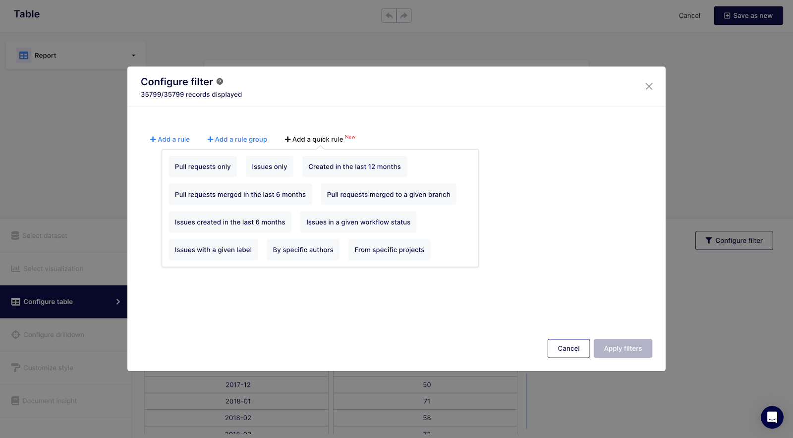
Get suggested filter presets to start configuring any metric with pre-configured conditions. The smart quick filters automatically adapt to the dataset you have chosen, by proposing dedicated and relevant presets. This useful feature allows you to rapidly configure metrics to match your exact needs, without having to create cumbersome filters on your own.
Activity Recap Dashboard
The Activity Recap Dashboard is a comprehensive tool providing an extensive overview of your project's lifecycle through 20 key insights, including Opened Pull Requests, Commits Made, PR Authors, and much more. Each metric is meticulously integrated to offer unparalleled project oversight.
The Activity Recap Dashboard will allow you to empower your team with data-driven decision-making capabilities, enhance collaboration and quality, ensure agility and responsiveness, and gain complete visibility across the development lifecycle.
Enhancements
Jira Data Center Integration
We've expanded our integration capabilities to include Jira Data Center, alongside our existing support for GitHub, GitLab Cloud and Hosted, Bitbucket, Trello, ClickUp, and Jira Cloud. This integration is currently in beta and aims to provide a seamless connection for comprehensive analytics and reporting capabilities.
Download Your Charts & Reports Data
Responding to user feedback, we've introduced the ability to download charts and reports data as CSV files. This enhancement allows for further data analysis and sharing, ensuring that you have full control and flexibility over your reporting needs.
Looking Ahead
As we continue to evolve Keypup, we're excited to announce that we will soon incorporate the build dataset as well as the historical events for other solutions. These updates will provide deeper insights into the post-development analytics (deployment phase), further enhancing our platform's capabilities and aligning with the needs of product managers and CPOs.
Keypup 2.2 is not just an update; it's a leap forward in empowering software development teams and their leaders to achieve their goals with precision and confidence. Embrace the future of project management with Keypup 2.2.
Introducing Jira Data Center Integration to Keypup
We're excited to announce a significant update that broadens the scope of Keypup's connectivity and integration capabilities. In our continued effort to provide comprehensive analytics and collaboration tools for software development teams, we've now added support for Jira Data Center. This new feature is currently in Beta and extends our existing integrations with GitHub, GitLab (Cloud and Hosted), Bitbucket, Trello, ClickUp, and Jira Cloud.
Expand Your Connectivity
Alongside our robust list of integrations, users can now connect Jira Data Center to Keypup, offering enhanced flexibility for teams operating in a Jira Data Center environment.
Beta Release Highlights
- Comprehensive integration: Seamlessly integrate your Jira Data Center with Keypup to unlock advanced analytics and reporting capabilities across multiple Jira sites.
- Streamlined setup: An easy-to-follow OAuth configuration process enables a secure connection between your Jira Data Center and Keypup, empowering you with enriched data analysis and project oversight.
How to Connect
- Whitelist IP addresses: (Optional) For Jira servers behind firewalls, whitelist Keypup's IP addresses for uninterrupted API communication.
- Application link creation: Configure an incoming link in your Jira server's Applications panel to establish the OAuth flow between Keypup and Jira Data Center.
- Seamless connection: Use the generated Client ID and Client secret to complete the connection on Keypup, ensuring your projects are ready for import with full analytics capabilities.
Enhanced Project Management
With unified analytics get a holistic view of your development activities, leveraging insights from your code collaboration tools integrated with Jira.
Security and Compliance
- Secure OAuth flow: Ensure a protected connection between Keypup and your Jira Data Center with OAuth, maintaining the integrity and security of your data.
- SSL certificate validation: Keypup supports publicly recognized SSL certificates for secure API calls, recommending against the use of self-signed certificates for optimal security and compliance.
We are thrilled to offer this new integration to our users, reinforcing our commitment to providing a versatile and powerful platform for software development analytics and project management. This update opens new avenues for teams to streamline their reporting processes, enhance project visibility, and foster a more data-driven engineering culture.
Explore this latest feature and elevate your Jira reporting capabilities with Keypup's advanced analytics today!
New Feature Release: Download Your Charts & Reports Data Now Available on Keypup
We're thrilled to announce a highly anticipated feature that our users have been waiting for – the ability to download your charts & reports data directly from Keypup. This new functionality enhances your ability to interact, analyze and share your data outside of our platform, giving you more flexibility and control over your reporting and data visualization efforts.
📊 Feature Highlights
- CSV export: You can now export the data behind any chart or report with charts into a CSV file, allowing for further analysis or reporting in your preferred tools.
- Comprehensive data access: This feature supports the export of up to 1000 records, ensuring you have access to extensive data for in-depth analysis.
- Seamless usage: The download functionality has been integrated directly into the dashboards. To download your data, simply click the "…" menu on any insight and select the export option.
- Universal availability: This feature is enabled for all charts and reports across the platform, offering a consistent and user-friendly experience for all your data export needs. This feature is also available for all plans, including the 14 days free trial.
🚀 How to Use This Feature
- Navigate to your dashboard: Open the dashboard where your desired chart or KPI is located.
- Access the menu: Click on the "…" menu icon on the top right corner of the chart or KPI insight you wish to export.
- Select export option: Choose the 'Export data' option from the menu to initiate the download of your data.
💡 Make the Most of Your Data
This new feature opens up numerous possibilities for data analysis and reporting. Whether you're looking to perform a custom analysis, integrate data into other reports, or simply keep a record offline, the ability to download your charts data ensures that your insights are always at your fingertips, ready for whenever you need them.
We understand the importance of being able to work with your data on your terms, and with this update, we're excited to offer you even more flexibility in how you access and analyze your insights.
Explore this new feature today and take your data analysis to the next level!
🚀 New Year, New Possibilities: Keypup's Latest Product Releases
The Dataset Exploration Dashboard
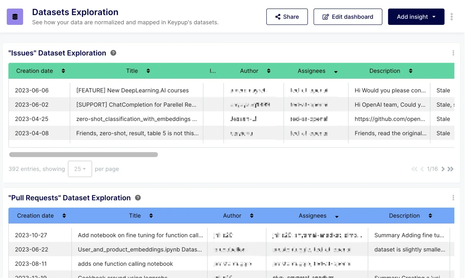
- Discover data transparency: Dive into our new Dataset Exploration Dashboard for a comprehensive overview of your software engineering data, directly sourced from connected Git repositories and project management projects.
- Key features: Explore datasets like Issues, Pull Requests, Commits from Pull Requests, Reviews, and Comments for in-depth analysis.
The Developer Summary Dashboard
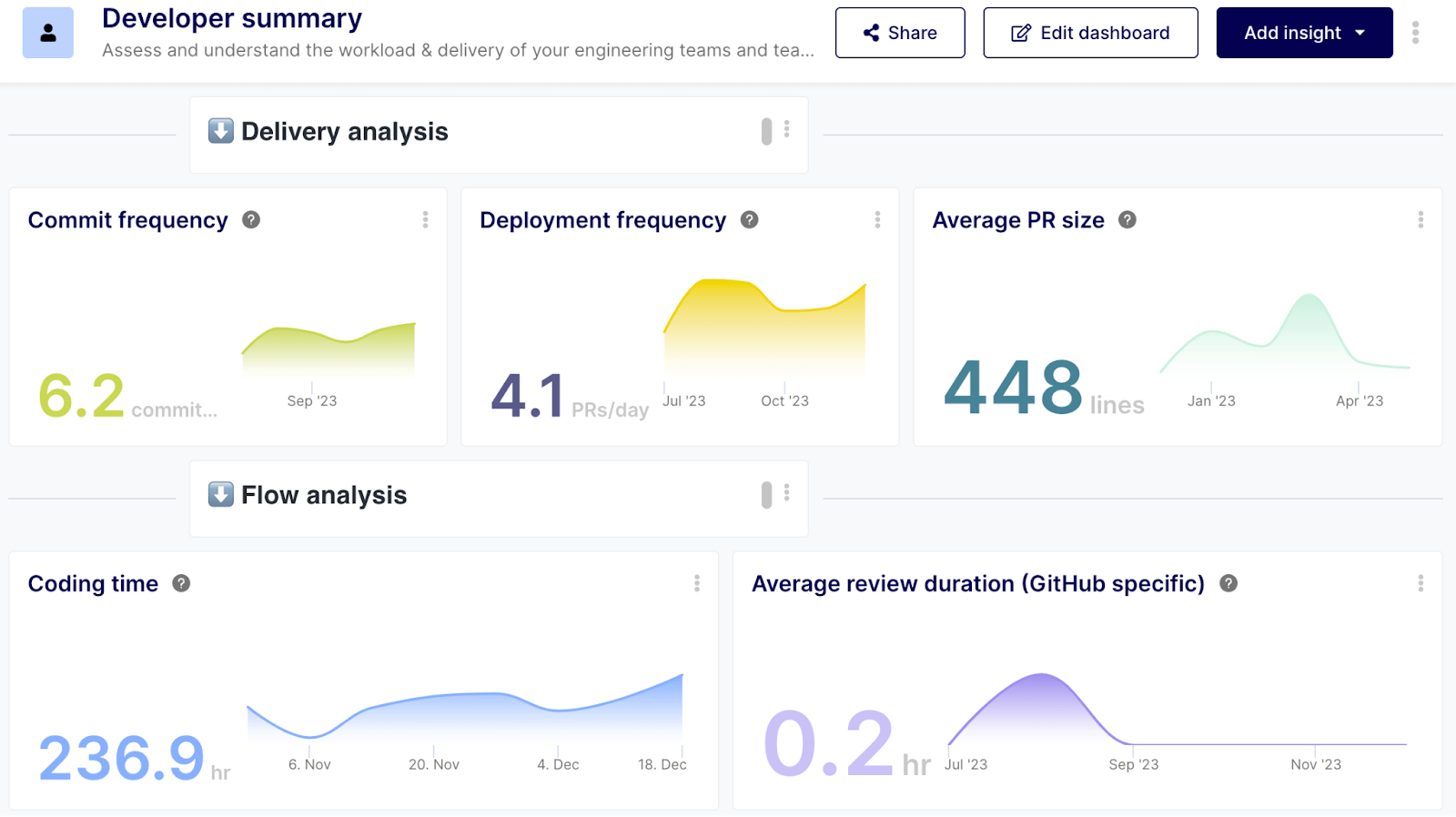
- Boost engineering productivity: Monitor crucial software developer metrics and improve productivity with our Developer Summary Dashboard.
- Metrics included: Commit Frequency, Deployment Frequency, Average PR Size, Coding Time, and more for a detailed engineering overview.
2023 Engineering Retrospective Dashboard
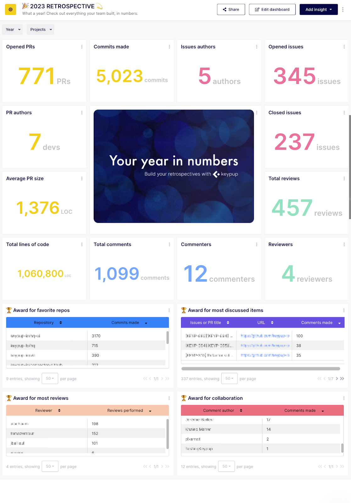
- Empower development with insights: Gain a bird's-eye view of your team's performance over the year, making it an essential tool for CTOs and tech leaders.
- Comprehensive analysis: Includes PR Pulse, Commit Chronicle, Issue Tracking, and more.
🛠️ Feature Enhancements
- Enabled KPI charts: Now display 2-12 records, providing greater flexibility.
- New operators: Including TO_FLOAT, TO_INT, TO_STR, and IF_MATCH for more robust data handling.
- Custom fields: Use custom fields in queries, significantly enhancing reporting capabilities.
🌟 Introducing Pickers for Filters: A Step Up in User Experience 🌟
Navigating the labyrinth of data fields has never been easier. With our groundbreaking dynamic Pickers feature, we're handing the power directly to you, our users. Complex filtering, which used to take minutes, will now be accomplished in seconds.
🔍 Key Highlights: Streamlined Filtering Across Multiple Datasets
Dive deeper and harness the full potential of your data with absolute ease. With the new dynamic Pickers feature, effortlessly select values from a comprehensive list across a range of datasets, directly retrieved from your own data:
- Issues & PRs Dataset:
- Commits from PR Dataset:
- Comments from Issues/PR/Reviews Dataset:
- Reviews from PRs Dataset:
Efficiency at Its Peak
No more manual entry or guessing values. With Pickers for Filters, every value you might need is immediately available.
Complex Filtering Simplified
Welcome a new era where intricate data input is a thing of the past. With pick-list values at your disposal, data navigation becomes a breeze.
Elevate Your Data Filtering Experience
With the new Pickers for Filters, we're setting a new standard in data interaction and analysis. Immerse yourself in your datasets with renewed confidence and efficiency. We eagerly await the incredible insights you'll derive using this feature!
Keypup's latest Innovations batch: Unveiling Features for October 2023
Visualization Enhancements
📈 Cycle-Time Chart
Visualize your entire development lifecycle from ideation to production.
Easily identify potential bottlenecks and areas for optimization.
🚀 KPI with Cycle-Time
Monitor key performance indicators tied directly to your cycle-time.
Make informed decisions backed by concrete data metrics.
⚙️ Gauge Chart
Gauge your development velocity and productivity in an intuitive, visual format.
📏 Log Scale Customization
Enhanced customization options for charts with the addition of log scales.
Available for lines & area charts, column & bar charts, and the gauge chart.
Google SSO
Introducing a frictionless way to get started with Keypup:
🔗 Sign-Up with Google
Quick and easy onboarding via your Google account.
Existing users can now link their Google account for an even smoother experience.
🎬 Seamless Dashboard Onboarding
Each dashboard now comes with a handy video guide defining each insight and its goal.
Locate this guide in the right panel of the Configuration Assistant for a seamless user experience.
Query Engine Upgrades
Our backend has received significant updates to provide users with more capabilities:
✨ Enhanced Filter Operators & New Operators & Aggregators
- "Contains any of" filter operator has been improved for both user and userlist fields, enhancing dashboard filtering experience.
- FLATTEN: Useful for breaking down array fields.
- LOG & LN: Enhanced mathematical functions for refined data analytics.
- EXP: Execute complex calculations with Euler’s number.
- LENGTH: Extended to support string parameters.
- RIGHT/LEFT: Extract specific portions from a string effortlessly.
- PERCENTILE & PERCENTILE_CONT: Derive both discrete and continuous values for any given percentile in a numeric field.
Boost Your Software Development Analytics with Keypup's Latest Features!
Explore the new capabilities, streamline your processes, and achieve unparalleled efficiency with your team.
Introducing the Pulse of Your Dev Process: The Cycle Time Dashboard!
Get ready to sync with the heartbeat of your development workflow! With the all-new Cycle Time Dashboard, you're not just monitoring; you're understanding every beat that drives your software engineering team forward.
Here are the newly released Insights 🚀
🔍 Coding Time Metric
- Gauge the pace of your development's core.
- Track both active coding periods and waiting intervals pre-reviews.
- Pinpoint early-stage bottlenecks for faster code delivery.
💬 Review Time Metric
- Delve deep into the duration of your full review cycle.
- Ensure robust collaboration and feedback processes for enhanced code quality.
🔧 Merge Time Metric
- Observe how long it takes to merge finalized work into production.
- Streamline transitions from task completion to code deployment.
🌍 Cycle Time Overview
- A panoramic snapshot of your development pipeline's health.
- Spot critical areas needing refinement and bolster your strategy.
📊 Cycle Time Breakdown
- Get granular by dissecting specific pull requests.
- Identify and rectify anomalies to maintain a consistently agile flow.
Bonus: Like all other Keypup metrics and dashboards, you can customize all templates to meet your organization definitions and processes.
The Cycle Time Dashboard is your roadmap to pinpoint and optimize every step of your development journey. Dive in today and bring your team's efficiency to new heights.
Unlock New Dimensions: Introducing Enhanced Visuals & Extended Datasets!
🌟 We’ve rolled out some exciting updates, designed to elevate your experience and provide deeper, more meaningful insights! Here’s a rundown of what’s new, complete with examples to get your creative gears turning!
🌈 Enhanced Visualization: Set Visual Thresholds on Your Charts
- Details: Whether it’s an Area, Line, Column chart, or a KPI with a sparkline, visual thresholds are now at your command.
- Example Use: If you're visualizing bug counts over time with a Line Chart, set a visual threshold to spotlight weeks where bug counts surpass the limit you've set, offering immediate insights into periods needing extra attention.
🔄 Extended Issues & PRs Dataset: First & Last Comment At
- Details: Dive deeper into your review dynamics with our new first_comment_at and last_comment_at data points! Especially useful for GitLab users, these timestamps offer insights into the initiation and conclusion of reviews, compensating for GitLab’s lack of a “review” concept.
- Example Use: Using GitLab? Detect when a review started on a merge request using first_comment_at. Use these new data points to detect the length of the review phase, in a broader way / discern the longevity and pace of dialogues on distinct threads, identifying bottlenecks or protracted deliberations impacting project timelines.
🕵️ Extended Reviews from PRs Dataset: Submitted At
- Details: For those utilizing GitHub, the exact submission times of reviews are now available, providing another layer to your analytical overview.
- Example Use: GitHub users can now refine review workflows by detecting the duration of reviews (submitted_at - created_at). This may be used to evaluate the average time spent in reviews as well as evaluate the depth of reviews by comparing the review time to the amount of code changed.
🤝 Bulk Invites: Invite Several Users at Once
- Details: Assembling your squad is more straightforward than ever! Invite your entire team in one go and hit the ground running from day one.
- Example Use: Initiating a new project with multiple department members? The bulk invite feature streamlines this process, cutting down administrative effort and ensuring immediate access for everyone.
Introducing Keypup 2.1: Flexible and Easy Data-Driven Engineering Analytics
We are thrilled to announce the release of Keypup 2.1! This version brings a range of powerful new features designed to facilitate your data-driven engineering journey. From simplified reporting and enhanced data visualization to smarter drilldown and collaborative capabilities, Keypup 2.1 empowers you to optimize your software development processes and make informed decisions in no time. Let's explore the exciting enhancements in this release.
Dashboard-wide filtering
- Combine multiple identical insight filters into a single dashboard filter
- Simplify and streamline engineering reporting efforts
- Gain a holistic view of your data at the dashboard level
- Save time, reduce complexity, and minimize errors in reporting
See our blog article about dashboard-wide filtering.
Data Hygiene Dashboard
- Gain insights into keyword, label usage, team’s proficiency, and more
- Spot trends and identify areas for improvement
- Facilitate more accurate reporting
- Optimize reporting practices and enhance data hygiene
See our dedicated page on the Data Hygiene dashboard for more details.
Enhanced data visualization
- Introduce new chart types: line charts, stacked area charts, stacked column charts, and stacked bar charts
- Present data in visually compelling and informative ways
- Track project progress, analyze performance metrics, and monitor engineering KPIs
- Make data-driven decisions confidently with enhanced clarity and insights
Smarter drilldown
- Enhanced data exploration with intelligent drilldown feature
- Recommended relevant fields based on dataset and insight configurations
- Simplified data navigation and saved time
- Uncover valuable insights efficiently for informed decision-making
Introducing the Guest role
- Invite guests to your team and share specific dashboards
- Guests have read-only access for data security
- Enable seamless collaboration with external stakeholders
- Promote transparency and effective communication
Expanded dataset for granular reporting
- Support additional fields for more detailed reporting
- Leverage story points, workflow status (board swimlane), issue type, time spent, time estimate, and parent issue
- Gain deeper insights into software development processes
- Drive informed decision-making with enhanced data granularity
Keypup 2.1 is an exciting release that simplifies your data-driven engineering journey. With dashboard-wide filtering, a Data Hygiene Dashboard, enhanced data visualization, smarter drilldown, the Guest role, and expanded dataset capabilities, you can streamline reporting, optimize collaboration, and gain valuable insights.
Keypup Releases New timestamps, Making SDLC Analytics more Granular Than Ever
We are thrilled to announce the release of 10 new timestamps, making SDLC process analytics extremely precise. These timestamps will allow users to calculate more granularly how much time is spent in each step of the development process, from ideation to production. The new timestamps include:
- First commit at - this field provides the datetime at which the first commit was made on a PR. It is populated based on the creation timestamp of the first commit in the PR or issue.
- Last commit at - this field provides the datetime at which the last commit was made on a PR. It is populated based on the creation timestamp of the last commit in the PR or issue.
- Review requested at - this field tracks the datetime at which the PR review was first requested. It is showcased by observing the datetime at which the requested reviewer's array attribute was first modified. (Note: this timestamp doesn’t apply on data collected prior to connecting to Keypup)
- Review last requested at - this field tracks the datetime at which a PR review was last requested. It is showcased by observing the datetime at which the requested reviewers array attribute was last modified. (Note: this timestamp doesn’t apply on data collected prior to connecting to Keypup)
- First review submitted at - this field provides the datetime at which the first review was submitted on a PR. It is populated based on the submission timestamp of the first PR review.
- Last review submitted at - this field provides the datetime at which the last review was submitted on a PR. It is populated based on the submission timestamp of the last PR review.
- Review rejected at - this field provides the datetime at which a PR was first rejected after a review. It is populated based on the submission timestamp of the first PR review with “request changes” status.
- Review last rejected at - this field provides the datetime at which a PR review was last rejected after a review. It is populated based on the submission timestamp of the last PR review with “request changes” status.
- Review approved at - this field provides the datetime at which a PR first met its minimum approval quota from approving reviews. It is populated based on the submission timestamp of the review that allows the PR to meet its minimum number of approving reviews while no “request changes” review is still active.
- Review last approved at - this field is calculated using the same logic as the “Review approved at” field. The populated date will be different from it only if the PR is rejected and approved again.
These new timestamps will allow users to gain a deeper understanding of the development process by identifying areas where progress is slow or inefficient and where improvement can be made.
Keypup's new timestamps will provide software development teams with the data they need to improve their workflows and increase productivity.
Try out these new timestamps today and accelerate your delivery!
Optimize Your Engineering Value Stream with the VSM Dashboard
Optimize and streamline engineering value stream like never before! We are thrilled to announce the release of our latest feature – the Value Stream Management Dashboard.
This new dashboard allows you to identify inefficiencies and reduce waste, while increasing efficiency across your software development teams and key projects. It includes valuable insights into the engineering value stream, such as Project Effort Distribution, Value Stream Workload Categorization, Planned vs. Unplanned Work Ratio, Value Stream Engineering Proficiency, Engineering Workload Distribution, and Engineering Work Pattern Analysis. These metrics enable teams to make data-driven decisions and optimize their workflows based on their unique goals and processes.
Keypup's Value Stream Management Dashboard enables teams to better balance workloads across critical projects, identify skill gaps, and enable a culture of continuous learning among the team, making it an essential tool for any software development team looking to optimize their value stream. Use it today and accelerate your engineering time to value!
Introducing Keypup’s Drill-Down Capabilities: Going Beyond the What and Providing the Why
We are thrilled to announce the release of our latest feature that takes software development analytics to the next level. Our platform now offers not only popular engineering metrics and customizability, but a way to drill directly into metrics to discover root causes. With the click of a button, users can access detailed reports that provide valuable insights into their organization's performance.
Our new drill-down feature allows users to dive into the details of any metric. Users can get a report out of the box that provides information such as projects, teams, users, or branches, giving them a comprehensive view of their organization's performance. Moreover, users can customize the drill-down feature entirely to highlight what they care about most, based on their unique organizational structure.
This groundbreaking feature goes beyond what other software development analytics platforms offer. By providing not just the "what" but also the "why " our platform empowers users to identify bottlenecks and take targeted actions to improve their organization's performance and scale efficiencies.
Try out our new feature today and see the difference it can make for your organization!
Expedite Software Audit with Keypup’s Audit and Compliance Dashboard
Get ready to take control of your software development lifecycle (SDLC) compliance process like never before! We are thrilled to announce the release of our latest dashboard feature - the Audit and Compliance Dashboard.
With this release, you can now assess the overall compliance of your team's SDLC with industry standards such as SOC2, ISO27001 or ITIL in real-time. Simply connect your Git(s) and get started today!
But that's not all, the audit and compliance dashboard is designed to help you address some of the most pressing questions when it comes to auditing your SDLC process. You can now easily track whether all pull requests (PRs) are verified with a green build and peer-reviewed before merging and which PRs and/or projects fail to comply.
The dashboard provides you with insightful metrics such as the Green Build Ratio, the PR Compliance Feed, the PRs Review Ratio and the Project Compliance Score, all of which help you leverage and adapt software audit metrics.
Say goodbye to manual compliance tracking and hello to effortless SDLC auditing with Keypup's Audit and Compliance Dashboard. Use it today and take control of your SDLC compliance process like a pro!
Build Engineering KPIs and Dashboards in Seconds with Keypup's Configuration Assistant
Get ready to revolutionize the way you build engineering metrics with Keypup's platform! With the brand-new Configuration Assistant feature, customizing your dashboards and metrics has never been easier. Say goodbye to the manual setup, and say hello to user-friendly questions that get you up and running in seconds!
Additionally, the Duplicate Dashboards and Metrics feature has just been released to production. Say goodbye to the hassle of manual formulas and filters copy-pasting. You can now copy any metric or dashboard with ease, and work with it to keep the original template configuration.
So what are you waiting for? Upgrade your Keypup experience today and enjoy seamless, hassle-free real-time engineering KPIs and metrics configuration!
Do you have some ideas of features, enhancements or templates we should include? Ping us via the in-app chat or email us at [email protected].
Keypup’s Feature: Introducing Keypup’s Sharing Capabilities and Collections, the Smart Way to Collaborate
We’ve made some enhancements to Keypup’s development intelligence platform to allow you and your team to better collaborate on shared dashboards and insights. These enhancements include:
Keypup’s Sharing Capabilities
You can now share your dashboards with your team members in Keypup. This sharing capability comes with the dashboard user permission roles “Editor” and “Viewer”. Editors will be able to collaborate on dashboards with you and apply changes, while viewers will be able to access dashboards in a “read-only” mode.
Keypup’s Collections
You can now browse through all your dashboard and insight templates from the Collections menu located at the bottom of the left navigation panel. From the “Collections” menu, you’ll be able to access your pinned dashboards (those directly accessible from the left navigation panel), the dashboards you’ve created, the dashboards shared with you and Keypup’s template library. Each dashboard can easily be pinned/unpinned, edited, shared, or deleted using the top left appropriate icon. You can also access, browse and delete any insight from your insights collection tab.
Do you have some ideas for features, enhancements, or templates? Ping us via the in-app chat or email us at [email protected].
Keypup’s New Insight Template: Streamline Software Development Lifecycle (SDLC) with Keypup’s Recommended actions
Using contextual information, Keypup's Recommended action field provides a suggested course of action for each open issue and pull request. It helps software engineering managers locate open pull requests and issues throughout the SDLC process and provides logical suggestions to help merge faster. Here is a pre-built template to help you leverage Keypup’s smart fields:
Recommended actions
This template provides a count of pull requests and issues organized by recommended action in the past 12 months. You can modify the dates or add filters to calculate it among specific projects and/or teams. Follow this link to try this template.
Below is the link to the full article on How to Streamline SDLC with Keypup Recommended Action Field.
Do you have some ideas for dashboard or insight templates to create? Ping us via the in-app chat or email us at [email protected].
Keypup’s New Insight Template: Personalize and Automate Change Failure Rate Calculation
We’ve made some enhancements to Keypup’s DORA metrics dashboard by introducing Change Failure Rate (CFR) insight templates.
CFR provides the percentage of deployment causing a failure in production. Elite performers have a CFR below 15%. There are several ways to calculate it. Here are the two templates launched to help you get started:
Commit Based Change Failure Rate
This template provides the ratio of fixed commits over all commits associated with merged pull requests in the past 12 months. You can modify the dates or add filters to calculate it among specific projects and/or teams. Follow this link to try this template.
Pull Requests Based Change Failure Rate
This template provides the ratio of bug-labeled pull requests over all merged pull requests in the past 12 months. You can also modify the dates or add filters to calculate it among specific projects and/or teams. As naming conventions vary from team to team, you can adapt the query to match your own. For example, you can edit the insight and replace “bug” with “defect”. Follow this link to try this template.
Do you have some ideas for dashboard or insight templates to create? Ping us via the in-app chat or email us at [email protected].
Keypup’s new features: product documentation is live, new widget, and filters improvements
We’ve made some enhancements to Keypup’s Development Intelligence solution to facilitate your journey with us and improve your experience.
These enhancements include:
Keypup’s new product documentation is now live!
The new product documentation has been integrated through elev.io. It is accessible through this link or directly from the app using the “Help” button. Users can search for the information they need or click on the red hotspot to get contextual information on-the-go.
Users have access to 150+ articles of all lengths, providing them with all the information they need to quickly become advanced users.
Release of the Textbox widget
In addition to the reports, charts, KPIs, cards and boards, users now have the ability to add Textbox widgets to their dashboards. This new widget type allows users to seamlessly communicate on dashboards to drive themselves or other users through their data story and provide perspective. They can use Textbox widgets to add content, context, to-do lists or engineering OKRs for examples. The data stories are limitless with this new addition.
Filters enhancements
The new time operators are now in production. They provide a range of “human-friendly” operators to filter on dates such as “last two months” or “within current month” or “next month” on top of regular after/before operators for specific dates.
Have some ideas of cool features or datasets to capture? Ping us via the in-app chat or email us at [email protected].
Keypup’s features enhancements: improved product usability
We’ve made some enhancements to Keypup’s Development Intelligence solution to facilitate your journey with us and improve your experience.
These enhancements include:
Insight Widget Designer’s enhancements
The “Configure source” step has been renamed “Select dataset” and moved to the top of the insight builder. The content of the pane was also reworked to make it more transparent that the purpose of this step is to select a dataset, not to configure fields or take any other action. The dataset fields are hidden by default - they can be displayed by clicking a link.
We no longer expand the formula input when focused to avoid distraction.
It is now possible to switch from a “large card” widget to a “board” widget and vice versa. A toaster notifies you about the actions that were taken, such as removing all columns when switching from board to “large card”.
To improve filtering, we removed duplicate custom fields for JIRA and GitHub. We also better organized custom fields inside the dropdown, with one section per app.
Displayed data increased
When working with tables, charts and KPIs, we increased the number of displayed data points from 100 to 500. This means that when grouping per week, you can now see up to 500 weeks of history (~ 9 years). When grouping per day you can now see up to 500 days (~ 1.5 years).
Dashboard Interface
We renamed the “Add Content” button to “Add insight”. The labels and icons of the shortcut dropdown have been reworked to be more self-descriptive.
Design improvements
Design > Loaders: All loading indicators are now consistent and use the same design.
Design > Empty insights: The legend is now hidden when an insight has no data and the placeholder content is displayed.
Have some ideas of cool features or datasets to capture? Ping us via the in-app chat or email us at [email protected].
Keypup 2.0 is expanding capabilities! What's New?
We’ve made some enhancements to the Keypup solution to help you make the most of our development intelligence platform.
These enhancements include:
The implementation of a Widget Template Library
You can now click on the “Add content” button (previously “Add Chart”) to display a modal with a list of blank and prebuilt templates including Delivery, Development Quality, DORA, Planning & Distribution. This approach will facilitate insight widget access and creation.
A Design update for filters
A UI overhaul has been launched to simplify the design of filters. As part of this update we added the ability to re-order rules (AND / OR).
Board card widget
You can now open the Pull Requests or Issues from the source app (GitHub, JIRA etc…) in a new tab instead of opening the detailed preview modal by doing a ctrl+click or cmd+click on a card.
Have some ideas of cool features or datasets to capture? Ping us via the in-app chat or email us at [email protected].
Keypup 2.0 is reaching new heights! What's New?
We’ve made some enhancements to the Keypup solution to help you make the most of our development intelligence platform.
These enhancements include:
The release of additional datasets including
- Commits from Pull Requests
- Reviews from Pull Requests
These two datasets include pre-made JOINs to be able to associate Commits and Reviews information with their Pull Requests.
The enhancement of Comments dataset
The initial “Comments” dataset has been enhanced with a pre-made JOIN to associate Comments to Pull Requests, Issues and Pull Requests review.
The improvement of custom formula capabilities
The formula engine capabilities have been enhanced with 30+ operators & functions (e.g. COUNT_IF, MIN/MAX, GREATEST/LEAST, ARRAY_FIND, NOW…).
The ability to sign-up from a template
Start your data-driven engineering journey with a template from the Keypup library for a more personalized experience.
The launch of a toast notification system
Toasts have been implemented to notify users of punctual or persistent events that occur on their Keypup workspace to inform and improve the experience.
The enrichment of filtering capabilities
It is now possible to filter comments, commits, pull requests and reviews using the pull request source or destination branch/repository. Filtering on the destination branch (e.g. branch = master) is particularly useful to differentiate pull requests coming from developers (features, bugs) vs maintenance pull requests (e.g. release pull requests).
Have some ideas of cool features or datasets to capture? Ping us via the in-app chat or email us at [email protected].
Keypup 2.0 is now available! What's New?
Keypup 2.0 allows you to track the areas of your development activities that are most important to you and your stakeholders, you can utilize the Keypup 2.0 platform to build bespoke reports, insights, and dashboards. It includes fully customizable templates to help you make the most of the development intelligence solution. Keypup 2.0 can be used for a variety of tasks, including:
- Get DORA Metrics, Sprint Overviews, Quality Insights, and more proven templates to help you improve your complete development outcomes.
- track and optimize your own operations with pre-built dashboards and insights.
- Adapt the templates to your specific goals and internal processes.
- Create your own dashboards, reports, and insights.
Look through our template library to pick the most appropriate one for your company.
Monitor your pipe with the Activity Funnel
The Activity Funnel is designed to show you the daily changes in your development pipe, exhibit the activity level of each stage and and highlight items that deserve attention.
- Based on your Team Board: changing the columns of your board will update the funnel view.
- Shows the activity of each stage: you can quickly identify PRs and issues losing momentum or becoming stale.
- Ability to drill down: click on each stage to see the relevant items and act on the ones deserving some love.
The Activity Funnel is still in beta. Have some ideas of cool features? Ping us via chat.
GitHub project card imported as custom field
The integration with GitHub has been extended to enable the following:
- Pull request and issue associations to GitHub Projects are now imported by Keypup (Project Cards)
- A GitHub custom field called “Project Cards” has been added to query filters
- You can use this field to restrict your reports, board columns and prioritization rules to GitHub Project items.
- This is particularly useful if you need to merge multiple GitHub Project boards in one Team Board on Keypup and ignore the rest (= ignore all untriaged issues not associated with a GitHub Project)
Manual priority assignments
This update enables the following:
- It is now possible to change the priority of a single item from your board or inbox
- This is useful to temporary raise the priority of items that need a kick
- This can also be used to reorder items on the team board, based on relative priorities
- The feature above comes on top of custom prioritization rules and Keypup’s natural ability to infer priorities as an 'override'.
Required Approvals fetched from GitHub/GitLab
The integrations to GitHub and GitLab have been updated to support the following:
- Number of required approvals now fetched from GitHub and GitLab for pull request reviews. If no required approvals are setup, Keypup still enforces a minimum of one.
- New recommended action “Assign missing reviewers”. If one of your pull requests is in review but missing reviewers to reach the minimum number of required approvals, you’ll know about it 😉
- Added “required approvals” and “required approvals remaining” to query filters. If you need to create reports, board columns or prioritization rules based on approval statuses, these new fields are the way to go!
New Agile Feature - Team retrospective
With Keypup Retrospectives, developers are finally able to provide feedback remotely, at their own pace, without interrupting their work.
- Retrospectives are easy to prepare, easy to run. You can schedule retrospectives at regular intervals, that you set to match your development cycles. Set the start date, the frequency of occurrence and the feedback window.
- When it's retro time, each developer will automatically receive an email or chat notification asking them to fill their retrospective and our platform will follow up automatically until completion.
- When a retrospective closes, an email is sent to the whole team with the results. You can access to the full report in Keypup. The report is shareable within the team and saved for easy exploitation. Each aspect of the project is analyzed factually to improve future deliveries.
We built this new feature for all the remote teams that struggle to prepare retrospectives and collect usable data. This feature will save teams hours of meetings and allow retro to actually be actionable, as every team member has a say and provides contextual feedback.
The retrospective feature is currently in beta. Want to provide feedback or ask for improvements? Don't hesitate to contact us.
Performance update - Faster data synchronization and UI loading
We recently brought various performance improvements to the platform to deliver faster data synchronization and data display. We also implemented a series of general improvements and bug fixes across the platform.
- Speed up third-party data ingestion and data enrichment processing time
- As part of this performance work, we also brought many improvements to Cloudtasker, our open source library for GCP Cloud Tasks . These improvements will soon be released as part of v0.12.0.
- Improve JIRA and Trello data fetching strategies, with better support for throttling and pagination.
- Improve UI loading strategy, using on-demand content loading. See our writeup on this approach on our blog.
- Improve default inbox prioritization rules, especially for items recently worked on
Connect multiple JIRA sites (multi-instance)
There are some cases where a company has multiple JIRA sites, either for different clients or different projects.
This new feature is for any agency, company or freelancer working on multiple client JIRA sites. We've made some enhancements for you to track projects across multiple JIRA instances. You can keep adding as many JIRA sites as you need then select which projects you wish to import on the projects page.
No matter the naming conventions and workflow specificities in your JIRA sites, you can harmonize your overall workflow statuses in Keypup.
Consolidate all JIRA instances on Keypup to have one nice organized view. You will now be able to remotely comment on issues belonging to the JIRA sites you connected.
Multiple JIRA instances + one Keypup account = One Global Workflow instead of multiple JIRA workflows completely separated from each others.
Better prioritization of implemented issues (to be closed)
This release provides better visibility of which issues are ready to be closed.
When an issue remains open after its related pull requests have been merged, we now move the issue back to the priority inbox of its assignees with the action close.
This new behaviour allows you to take action on the issue, that is either re-assign it to people which must still do work on it (e.g. end to end testing) or simply close it. No dangling issue due to someone forgetting to close it!
Along with this new feature we now display issues which are currently being implemented by pull requests in the Coming Up tab with the action Wait for PR. This allows you to see at a glance which issues are currently being worked on, but without spamming your actual inbox. As with pull requests, you can see the unified feed of discussions on these issues.
Shareable dynamic reports (Data Explorer)
The Data Explorer already allows you to query any development items from your projects without API and create reports.
We updated the Data Explorer with shareable reports.
Share your reports with your team or individual members.
What's great about this feature is the ability to share your reports directly with your teammates, so that you track the same things at the same time - and you can work in sync with your team and collaborate faster.
In the Query editor, just select the visibility of your report before you save it. You can also pin this report for all team members' priority inboxes and choose the order of appearance in their priority tab.
Feature improvement - Pull request and issues linking
Major improvements have been made on the auto-linking feature along with our December 2020 feature release, the Team Board.
Pull request and issues linking is quite an essential concept in Keypup because it allows for two things:
- Pull requests and related issues are automatically grouped in your Priority Inbox or the Team Board. This considerably reduces the number of items to deal with on a daily basis and makes for a clean, easy and direct reading of everything a Pull Request addresses (including all nested issues). More convenient than having to conduct speleological searches in your repo, no?
- Pull request due dates are automatically inferred based on the due dates of related issues. This means Keypup can properly prioritize pull requests to the right person when moved to review or merge status.
There are multiple ways to link issues to pull requests.
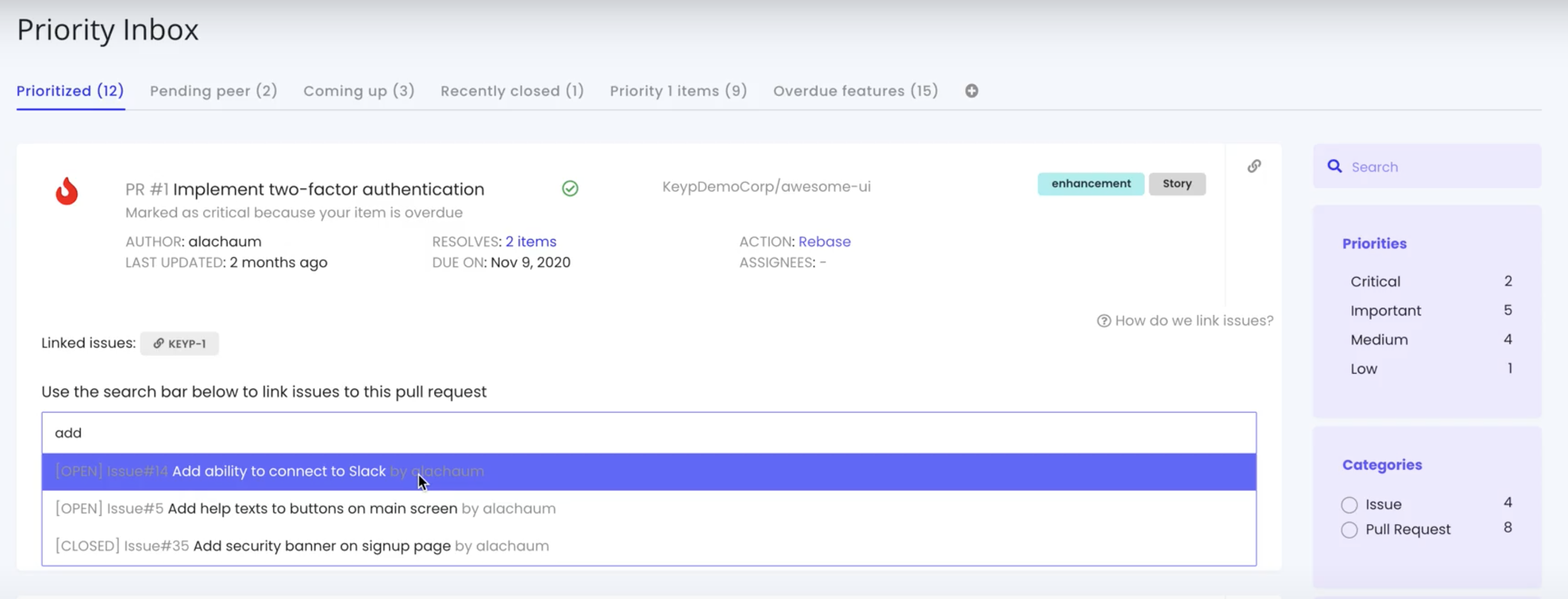
You can link issues and pull requests from the Priority Inbox (checkout our docs below)
Or you can link issues using closing keywords directly from GitHub and GitLab via:
- Pull request title
- Pull request description
- Commit message
The Keypup Priority Inbox
The purpose of the priority inbox on Keypup is to gather items that you - as a developer - must action rapidly. The priority inbox leverages data from all apps you connected in order to evaluate the priority of items and the actions to take for each of them.
The priority inbox currently provides two actions.
Link pull requests to issues
Issues can be related to pull requests using keywords in titles, descriptions, and commits. Keypup will automatically combine items and activity feeds.
Comment on pull requests or issues
A Quick reply field is also available for on items and related items (related items appear when a pull request is grouped with related issues).
Auto-linking all issues and discussions to pull requests
The auto-linking feature allows issues to be related to pull requests and have Keypup group these items automatically in your Priority Inbox for a better visibility.
You don't need to do anything extra as it integrates natively with existing auto-linking features of GitHub or GitLab or Bitbucket.
The auto-linking feature automatically creates a unified conversation feed across all items. This makes it way easier to ensure that you haven't missed any update on a related item. Note that you can still access each individual item-related discussion separately as well.
The auto-linking works with any number of issues and you get a nice summary by clicking on the inbox item.
Remote actions
Remote actions give you the ability to action items directly from Keypup. So that in one click you can trigger actions in all your connected tools at once.
Merge pull requests in GitHub or GitLab as well as comment on items in apps directly (GitHub, GitLab, JIRA or Clickup), all of that from the one place at once.
Quick reply on items
This quick reply feature is compatible with PRs which are auto-linked to issues. Commenting on the unified feed will comment on the PR itself, while commenting on an item-specific feed will create a comment in the remote system this issue belongs to (e.g. JIRA).
Merge pull requests straight from the Review & Merge Board
The Review & Merge Board, provides the capacity of merging your pull requests in one click. Items flagged as "Merge" in your review & merge board can now be merged directly from Keypup! No need to navigate to GitHub or GitLab to do so!
Keybot, the developer's assistant is released
"Hello, my name is Keybot. I am pleased to meet you. You are a developer and I am your new best friend - I will help you daily by simply communicating with you by email or on Slack to help you navigate your priorities."
Keybot is your new development assistant. Get any insights on all your development and issue trackers tools.
What does Keybot do?
You can find Keybot in your email inbox or on Slack. He helps sort out all your Pull Requests, merge reviews and more.
- ⏰ Daily digests with your top priorities
- ✅ Green PR Merge recommendations
- 🔍 Provides answers on your development queries - for instance the state of pull requests
Because Monday needs an extra push, Keybot sends a complete summary of your development project progress, a short digest of your most urgent priorities, and the reason why I know it's urgent - either because of the due date of an item, or because of its criticality.
Bitbucket integration
Our Bitbucket integration allows you to import pull requests into Keypup and better track development activities across all projects in one place - especially if you connect JIRA as well.
Get instant clarity on your pull request statuses. Finally a clear tracking view individually and across the board.
Pull Requests and JIRA issues nicely aggregated and prioritized
Tag JIRA or Trello issues in your pull request commits or title and Keypup will automatically aggregate those. Pull requests will automatically be prioritized based on due dates of attached issues.
All your pull requests in one view
Struggling to follow pull requests across all your Bitbucket projects? Keypup centralizes them all in the Review & Merge board to give you an easy way to follow what's going on.
Developer board or JIRA board? Both!
Using JIRA or Trello to track your Bitbucket development? Is that JIRA board not developer-centric enough? Get your own automated development board with Keypup.
Create your own reports
Need a better overview of Bitbucket activity? Create your own report on current or past pull requests to get a better understanding of development activities.
Trello integration
Our Trello integration allows you to import project management data directly into Keypup and easily link cards to pull requests to get better visibility on what is getting resolved and when pull requests are due.
Link Trello cards to pull requests
Keypup now allows you to link Trello cards to pull requests, giving you the best of both worlds: project management data synced with repository data!
Simply use the URL of a Trello card in your pull request title or description.
Quick replies on cards
Quickly reply on cards from the Priority inbox, either directly on the card or via the activity feed when a card is nested under a pull request. Call that a time saver! (plus again, keeping data/comments consistent across all other apps).
Jira integration
Our JIRA integration allows you to import project management data into Keypup and easily link issues to pull requests to get better visibility on what is getting resolved and when pull requests are due. Our integration also includes JIRA's custom fields, for maximum tracking efficiency.
Turn JIRA into a simple, effective development tracking tool.
Keypup now allows you to link JIRA issues to pull request, giving you the best of both worlds: project management data synced with repository data !
Simply use the URL or a key of a JIRA issue in your pull request title or description
Quickly reply on issues from the Priority inbox, either directly on the issue or via the issue activity feed when an issue is nested under a pull request.
ClickUp integration
Our ClickUp integration allows you to import project management data into Keypup and easily link issues to pull requests to get better visibility on what is getting resolved and when pull requests are due, among others.
What is the ClickUp integration for?
Link ClickUp cards to pull requests
Keypup now allows you to link ClickUp cards to pull request, giving you the best of both worlds: project management data synced with repository data !
Simply use the URL of a ClickUp card in your pull request title or description.
Quick replies on cards
Quickly reply on cards from the Priority inbox, either directly on the card or via the activity feed when a card is nested under a pull request. Call that a time saver! (plus again, keeping data/comments consistent across all other apps).
GitLab hosted is now supported!
Keypup now allows you to connect hosted GitLab instances, giving you the best of both worlds: the Gitlab hosted instance you are used to and like combined with the full power of the Keypup engine to help you be more efficient and gain visibility and agility.
In order to complete the connection process you'll need to create an OAuth application in GitLab. Nothing too complicated as you know
It's a great feature because you can enhance your workflow and gain precious time with these remote actions from the dashboard:
- Link merge requests and issues: merge requests and issues can be linked to each other directly from the Priority inbox using the 🔗 icon. In order to link items we update the description of the parent merge request and add a "closes: https://issue-url.domain" auto-linking keyword at the bottom of it.
- Merge pull requests: approved merge requests with a green build on the Keypup platform - if any - and a mergeable status can be merged directly from the Keypup Review & Merge board.
- Quick reply on items: it is possible to comment on a merge request or an issue from the Priority inbox. For issues replies can be done either directly on the issue or via the issue activity feed when an issue is nested under a merge request.
Agile Board for developers
The team board is a visual way to follow the progress of issues and pull requests across all your usual tools, individually or as a team. Unlike Trello or JIRA, there is no need to move cards - the board is automatically updated based on the status of items.
Each column in the board is configured to retrieve issues and pull requests matching specific criteria. By default columns are configured in the following way:
- Todo: Any open issue with at least one assignee
- In development: Any open pull request which is not currently in review or for which changes have been requested
- In review: Any open pull request for which a review has been requested or any pull request which has been approved but currently having build issues or conflicting with the base branch.
- Mergeable: Any open pull request which has been approved, has a green build and does not conflict with the base branch.
- Done: Any issue or pull request which has been closed or merged within the last 3 days.
Columns can be fully customized to match your own development steps and workflows. So you do not need to stick with the default ones.
By default the Team board shows you the progress of items across all team members. You can filter the board for a specific Team Member by using the View as filter.
The Team Board can easily be customized to better fit your development workflows. If you are using Scrum, Kanban or a mix of both, the Agile board can accomodate all tracking methodologies at the same time. All projects, no matter which methodology, in the one consolidated board.
This is not just another Agile board. It is not complicated. It is not for the project manager. It is a simple, yet powerful agile board designed specifically for developers by developers.
Build dynamic reports based on JIRA custom fields
Keypup now provides auto-discovery of JIRA custom fields because we know that most developers will customize their Jira to suit their needs.
Upon connecting your JIRA instance, Keypup automatically fetches and makes available filtering all JIRA fields with supported data types - this way, your own custom Jira is now ready in Keypup.
JIRA custom fields can be complex and we do our best to provide filtering that makes sense. Base JIRA fields are often composed of arrays, nested objects etc.. The Data Explorer automatically generates field and sub-field filters for these more complex fields as well.
Slack integration - Keybot gets smarter
Our Slack integration sets Keybot up - your soon-to-be best friend, and more pragmatically Keypup's communication bot - into your workspace to communicate with you when important events occur.
It is also possible to ask questions to Keybot to quickly get an overview of the status of pull requests, issues and development tasks. For example asking "Which PRs are ready to be merged" will prompt Keybot to return the list of pull requests which are mergeable, have a green build, and have been approved.
Morning digest
Keypup users on Slack receive a morning digest every day at 9:05 am with the top priorities of their Priority inbox. And because we know Mondays need an extra push, Keybot will start the week with a comprehensive digest of your activities from last week and your outstanding priorities for this week. Handy, right?
Merge recommendations
When pull requests are mergeable, have a green build, and have been approved, Keybot will send a notification to project maintainers and propose to merge them. One click, and merged they are!
Asking questions to Keybot
You can ask questions to Keybot to get an update on pull requests and issues.
Here are a few examples of questions you may ask:
- How many PRs can be merged?
- Which PRs can be merged?
- How many issues are open?
- How many PRs have been merged last week?
- Which PRs are ready to be reviewed?
- ...and more!
GitHub integration
Our GitHub integration allows you to import pull requests and issues to better track development activities across all projects in one place.
Get instant clarity on your pull request statuses.
Pull requests & issues prioritized and automatically aggregated
Development items are automatically prioritized based on due dates and recommended actions in your Priority inbox.
Track your items easily by linking your issues and pull requests. You can make comments that will be disseminated in GitHub.
Merge pull requests in one click
Keypup evaluates the readiness of a pull request and give you recommend actions. When Pull Requests are mergeable, have a green build and have been approved, Keypup will send a notification to project maintainers.
Pull Requests can then be merged directly from in just a click from the Review and Merge board.
Query repository and development data and save reports with the Data Explorer
The data explorer allows you to easily query pull request and issue data and save these queries as reports. Reports can also be pinned as tabs on your Priority Inbox for easy access.
No API calls. All queries and reports in the one place. Yep - that simple. And really performing - the reports you will get can be customized at will and have many conditions. Oh, and they're dynamic, so once created, you can just follow up on them to see your progress.
You can find all your JIRA custom fields to perform queries. They will be automatically added to the standard fields.
Reports are shareable - so not only can you share them directly with your PM, but also with any of your teammates, so that you track the same things at the same time - and you can collaborate faster.