Your software engineering team needs to be able to operate at peak performance to scale your organisation, build quality products faster, and reduce the time it takes to release new features and updates. In order to do this, you need a software engineering dashboard that provides visibility into how your team is operating and what should be improved. A software engineering dashboard can help you identify bottlenecks in your process and see where there are redundancies or unnecessary steps slowing down the process. This will allow you to streamline your workflow and remove inefficiencies so that your team can scale more efficiently. A software engineering dashboard is a visual display of data on a particular topic (e.g., Software Delivery, Sprint Planning, etc.). You can create an effective software engineering dashboard by identifying the key metrics that matter most and coming up with several ways of measuring those metrics so you can see them from different angles. Let’s take a look at four types of software engineering dashboards you should implement in your organisation if you want to scale more efficiently.
The process of building dashboards to meet the needs of your unique organisation and processes
Every organisation is different and will have different needs and challenges. Therefore, you’ll need to create software engineering dashboards that are specific to your organisational needs and challenges. This will ensure that you’re tracking the engineering metrics and KPIs that matter most to your organisation. You’ll also want to consider what type of data-gathering tools and methods will be most effective for your needs. There are many different types of software engineering dashboards that are typically used by organisations.
In this article, we will cover some of the most common types of software engineering dashboards including:
- Software Delivery Dashboard - A dashboard providing consolidated software delivery insights to monitor software development capabilities and performances.
- Software Quality Dashboard - A software quality dashboard is used to provide key insights on software and code quality such as bugs raised, refactoring ratio, bugs severity, and more.
- Sprint Planning and Monitoring Dashboard - A sprint planning and monitoring dashboard helps the team track its progress against the sprint goal and make adjustments as needed.
- Development Assistant Dashboard - This type of dashboard is directed at each contributor. It helps developers keep track of their items and identify potential bottlenecks or need for support and/or tools.
Software Delivery Dashboard
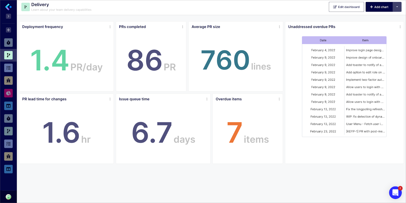
A software delivery dashboard tracks progress throughout the software delivery process. It shows the deployment frequency, the completed pull requests, the average size of pull requests, the lead time for changes (applied to pull requests), the Issue average queue time, the number of overdue pull requests and issues and a list of unaddressed pull requests. The goal is to help management and stakeholders see the progress of the project at a high-level with minimal effort, and no data mining… You might also want to include a graph that shows the number of new features being developed over time, as well as a graph that shows the number of bugs being resolved over time.
Try Software Delivery Dashboard
Software Quality Dashboard
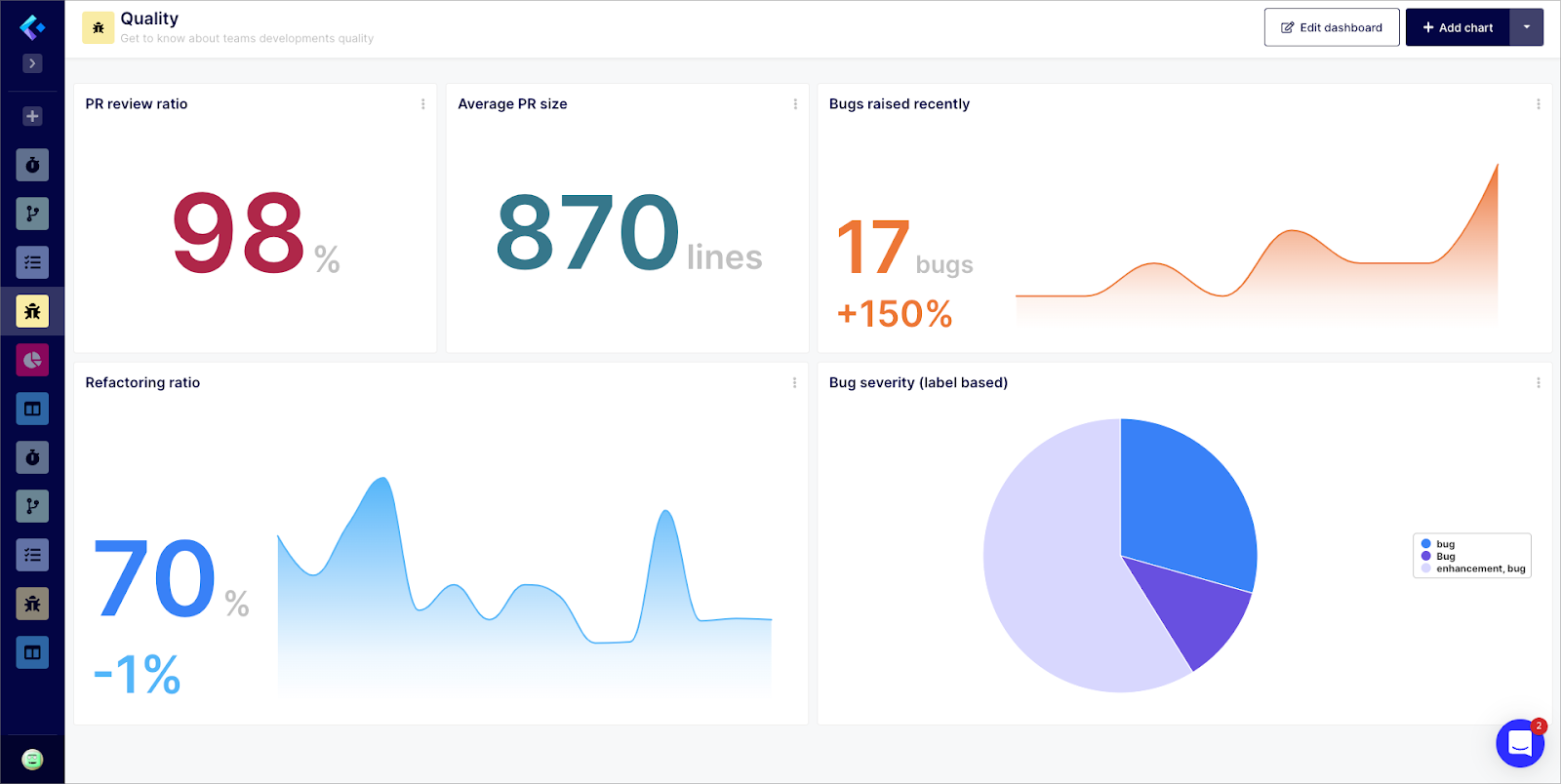
A software quality dashboard is used to track software quality and code health. It can also be used to track workflows performance related to code reviews and code deployments. A few examples of metrics that would be included in a software quality dashboard include the pull requests review ratio, the number of bugs raised and how it is trending over time, the software refactoring ratio, the average pull request size, and the bugs sorted by severity. Another aspect of a software quality dashboard that should be included is information on the health of your codebase. You’ll want to track things like the number of dependencies in your codebase, and the percentage of comments in your codebase. Ideally, you want your codebase to be as clean and straightforward as possible with as few dependencies as possible. This will make your codebase easier to manage and work with, which will make it easier for your employees to do their jobs effectively and for any tech lead to manage technical debt with ease.
Try Software Quality Dashboard
Sprint Planning and Monitoring Dashboard
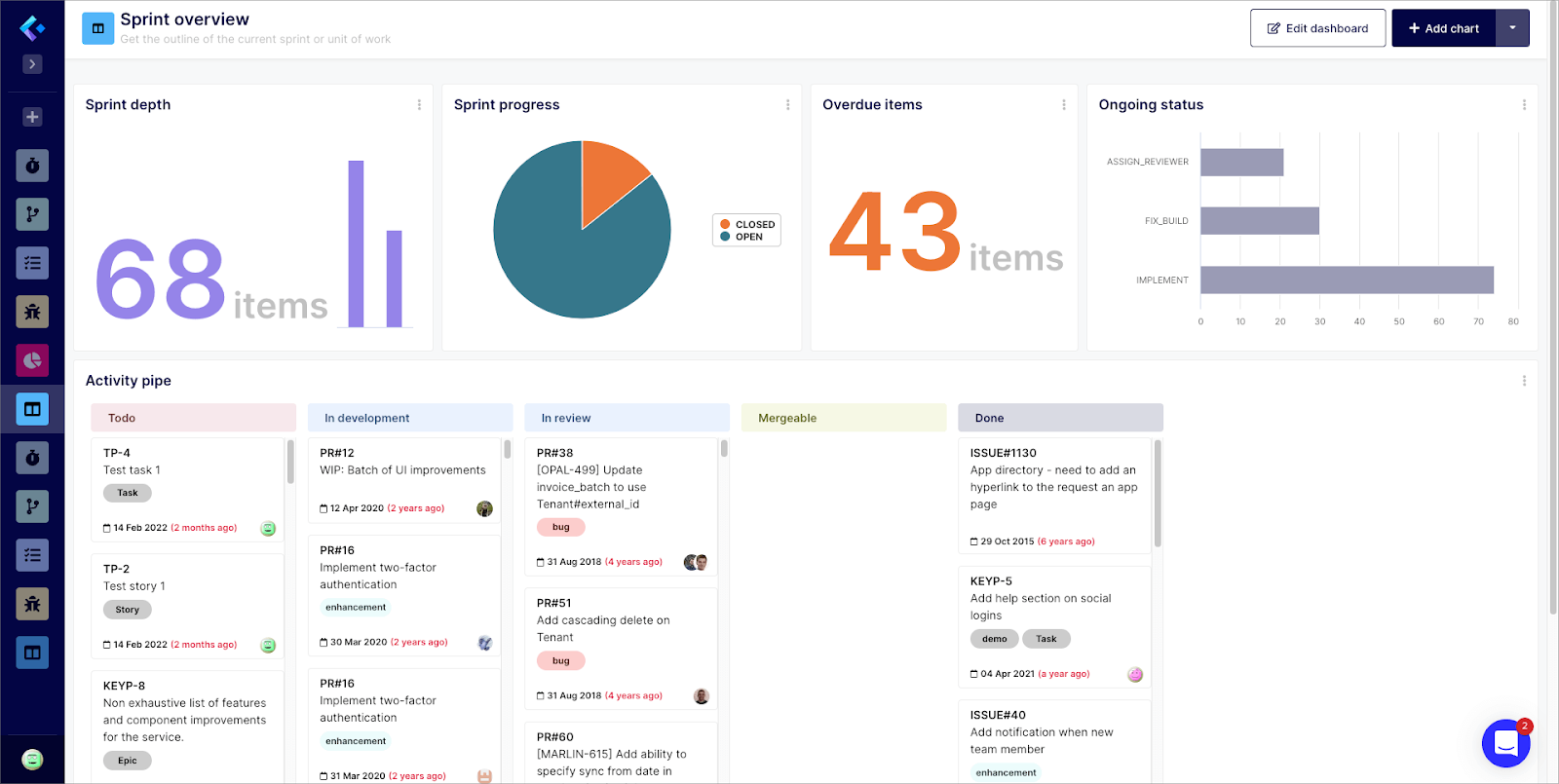
A sprint planning and monitoring dashboard helps the team track the number of tasks completed throughout the sprint. This is where the team will track its progress against the sprint goal and make adjustments as needed. Key metrics displayed on a sprint planning and monitoring dashboard include the number of scheduled items including pull requests and issues, how the sprint is progressing, the number of overdue items, the status of each item and a board of items (pull requests and issues) classified by development stage. You can also include graphs related to bugs if they are scheduled in the sprint.
Try Sprint Planning Dashboard
Software Developer Assistant Dashboard
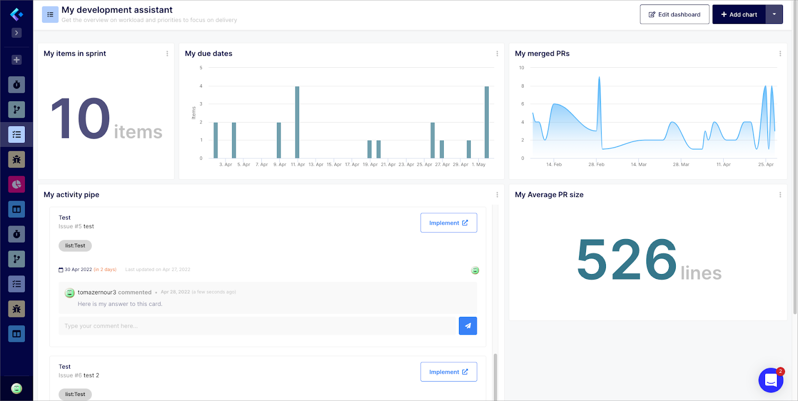
A software developer assistant dashboard is used to track metrics related to the software developer work. This data can be used by each software engineer to monitor their own progress and identify potential bottlenecks, need for support or areas of improvement. Some of the key metrics that would be shown on a software developer assistant dashboard include the number of items (pull requests and issues) in sprint, the number of items classified by due date, the total number of merged pull requests, the average PR size he’s handling and a board or card displaying his activity pipe. You can also show graphs that track the amount of time spent on certain tasks over time. Ideally, you want the graphs to show that the amount of time being spent on tasks is decreasing over time, which would indicate that your team is becoming more efficient with their time and will help in annual performance review.
Try the Development Assistant Dashboard
Conclusion
The best way to scale an organization and build quality products faster is to have an effective software engineering process in place. You should measure the actual effectiveness and prepare to scale at all times. One way to scale is to create software engineering dashboards that provide visibility into the process and help identify areas where improvements can be made. There are several different types of software engineering dashboards you can create, each of which provides visibility into different aspects of the software engineering process. The most important criteria when selecting an analytics software for the engineering organisation is to ensure:
- The tool integrates with your development stack
- It doesn’t require data engineering otherwise it would be too long to implement and might necessitate additional skills
- It is flexible enough to match your specific needs and processes
- It is providing you with templates to start with easily and rapidly
Tell us which dashboards and/or metrics are efficient for you while scaling your engineering organisation via Twitter!


